How to measure website engagement
Engagement is the question every analytics metric gestures at and none of them answers alone. Which numbers capture which slice of it, what each one quietly misses, and how to build an engagement picture you can act on.

Engagement is a question, not a metric
"Are people engaging with the site?" sounds like it should have a number, and every analytics tool offers several - engagement rate, time on page, scroll depth, pages per session. None of them is the answer. Each measures one observable slice of a thing that isn't directly observable: whether visitors found what they came for and cared. The practical skill isn't picking the right engagement metric. It's knowing which slice each metric actually captures, so you can combine a few of them into a picture and act on it without fooling yourself.
This post is that map. The individual metrics have their own deep dives on this site - GA4's engagement rate, scroll depth, session duration and its lies - and this is the layer above them: what engagement measurement can honestly deliver, layer by layer.
How we got here: the metrics engagement used to mean
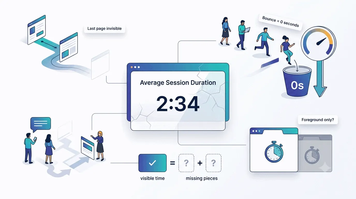
For fifteen years, engagement measurement meant two numbers, and both were worse than they looked. Bounce rate - the share of single-page visits - treated a reader who spent four minutes absorbing one article and left satisfied identically to someone who left in two seconds, a flaw the benchmark conversation still trips over. And time on site was computed from gaps between pageviews, which meant the last page of every visit counted as zero and a single-page visit counted as nothing at all, however long it lasted.
GA4's engagement metrics exist because of those flaws, and knowing the history inoculates you twice over: against old advice written for the old metrics ("get bounce rate under 40%" belongs to a dead measurement regime), and against tools and reports that still compute time the classic way. When two tools disagree about engagement, the first question is which definitions each is using - it usually is the whole disagreement.
The analytics layer: what GA4 calls engagement
Modern analytics starts with a binary. GA4 counts a session as engaged when it clears any of three bars: it lasts longer than ten seconds, records a key event, or views a second page. Engagement rate is the share of sessions that cleared a bar, and bounce rate is now literally its inverse. The bar is low on purpose - it separates "arrived and left instantly" from everything else, nothing finer. Worth knowing: the ten seconds is a per-property setting, adjustable up to sixty, so two sites' engagement rates aren't automatically comparable.
The richer number is engagement time. Google defines it as time with your page in focus - the clock stops when the visitor switches tabs, backgrounds the app, or navigates away. That makes it the most honest time metric mainstream analytics has ever shipped: the fifteen open-but-ignored tabs that inflated classic session duration count for nothing. An "average engagement time" of 50 seconds means 50 seconds of the page actually on screen.
Together those two - engagement rate for breadth, engagement time for depth - are the analytics layer's contribution. They're counted for every visitor automatically, which no other layer below can claim. What they can't tell you is what the attention was: 50 focused seconds of reading and 50 focused seconds of confused searching look identical.
What every engagement metric quietly misses
Each number's blind spot is structural, not a bug to await a fix for. Focus-time counts attention on the page but can't see attention on the content - a paused visitor reading a printout, or thinking, is invisible. Scroll depth measures the page moving, not the eyes following: a flick to the footer scores 100%, careful reading of the top half scores 50%. Pages per session rewards both fascination and disorientation - the visitor who can't find anything clocks an excellent number. And clicks measure interaction, which correlates with interest and also with frustration - the rage click is engagement's evil twin.
None of this makes the metrics useless. It makes them directional instruments whose errors mostly cancel when you read several together and mostly mislead when you crown one. A page with rising engagement time, healthy mid-page scroll and a growing return rate is engaging by any sane reading. A page that wins on exactly one metric deserves suspicion in proportion to how proud of it you are.
There is no benchmark, and that's fine
The first question everyone asks - "what's a good engagement rate?" - has no honest answer. We've looked repeatedly for engagement benchmarks with published methodology and found marketing content instead: round numbers with no basis, averages across incomparable sites, vendors quoting each other. The variance is structural: a documentation site, a recipe blog and a checkout flow have wildly different natural engagement shapes, so an average across them describes nobody.
The usable comparison is you-versus-you: this month against last, this page against your site's typical page, visitors from one source against another. Trends over levels, always. A number that rises after you change something is evidence. A number compared to a stranger's average is astrology with decimals.
Cut it by segment or learn nothing
Sitewide engagement numbers average away everything interesting. The same site can serve deeply engaged newsletter readers and instantly-bouncing ad clickers, and the blended number will report bland normality throughout. The two cuts that pay: by traffic source - engagement is the honest quality score for each channel, and the source sending the most visitors and the source sending the most engaged ones are frequently different - and by page or page type, where the blog, the product pages and the landing pages each have their own engagement physics.
The compound question is where this gets genuinely useful: which source's visitors engage with which pages? Ad traffic that ignores the blog but engages with pricing is telling you something no sitewide number contains. Start with source-level engagement rate in any analytics tool - it's one report, and it reorders marketing priorities more often than any vanity dashboard.
What engagement means depends on what the site is
Before comparing any numbers, decide what engaged even looks like for your site, because the healthy pattern differs by type. On a content site, engagement is reading: long focus time, deep scroll, and return visits are the whole game, while pages-per-session barely matters - one article read fully beats five skimmed. On a store, it's nearly inverted: browsing depth and product-page interaction matter, but the truly engaged shopper might spend ninety efficient seconds and buy - long sessions on a store often mean confusion, not love.
A SaaS marketing site is different again: the visit is short by design, and engagement means reaching the pages that do the persuading - pricing, docs, comparisons - rather than lingering anywhere. Even a support section inverts the usual reading: falling time-on-page there can mean the answers got easier to find. The general rule hiding in the examples: define the engaged visit for your site in one sentence first, then pick metrics that would detect it. Metrics chosen before the sentence measure whatever's easy instead of whatever's true.
The signals analytics doesn't count
Some of the strongest engagement evidence never passes through a tracking script. Returning visitors are engagement stretched over time - a rising return rate means the site earned a second visit, which outweighs any single-session metric. Direct traffic growth carries a similar signal: people typing your address or using a bookmark chose you before the page even loaded. Email answers it from another angle - subscribers, open behavior, and actual replies are engagement with a name attached.
Then there's the unmeasurable tier: comments, shares, people mentioning the site somewhere that later spikes your traffic, a customer quoting your article back at you. No dashboard aggregates these, and a handful of them is worth more than a point of engagement rate. Keep a note file - it's the only instrumentation this layer gets.
The quality layer: watch engagement happen
When the numbers say engagement changed and you need to know what changed, switch instruments. A heatmap shows where attention pooled on the page - which sections earned reading, where the scroll cliff sits. A handful of replays shows individual engagement as it actually unfolded: the reading rhythm, the hesitations, the difference between purposeful and lost. Ten minutes of footage regularly resolves what a month of metric-watching couldn't.
The pairing matters in both directions. Metrics without the qualitative layer produce confident misreadings, and replays without metrics produce anecdotes. The workflow that holds up: metrics to notice and locate, footage to explain, metrics again to confirm the fix moved something.
Improving engagement without gaming the metric
Once a number becomes a goal, the temptation is to move the number instead of the thing it measures - and engagement metrics are especially gameable. Splitting articles into paginated slideshows lifts pages per session while making readers hate you. Autoplaying video inflates focus time. An exit popup technically extends the session it interrupts. Each trick moves a dashboard and degrades the actual engagement the dashboard was supposed to track, which tends to show up later in the signals you can't game - return rates, subscriptions, reputation.
The non-gamed improvements are unglamorous and compound: answer the visitor's question earlier on the page, make the next relevant step obvious (the humble related-links block does more for honest pages-per-session than any widget), fix the pages where footage shows people struggling, and cut the content that survives only because deleting feels wasteful. A useful self-check before shipping any engagement optimization: would this change still make sense if the metric didn't exist? If not, it's a decoration for the dashboard.
A working engagement scorecard
Write the five numbers down each month next to last month's. The writing-down is the analysis - patterns you'd never notice in a dashboard announce themselves in a column of your own handwriting.
Five measures, one from each layer, reviewed monthly - enough to answer the engagement question without drowning in it:
- Engagement rate by traffic source - breadth, and your channel quality ranking.
- Average engagement time on your five most important pages - depth, where it matters.
- Scroll depth on one long page you care about - is the content below the fold earning its keep?
- Returning visitor share, read as a trend - the over-time verdict.
- One qualitative check: five replays or one heatmap review of a page whose numbers moved.
The practical takeaway
Measure engagement in layers: GA4's engaged sessions and focus-time for automatic breadth, segments to make the numbers mean something, return behavior for the long game, and replays or heatmaps when you need the why. Refuse single-metric stories and stranger benchmarks equally. In Bigdelta the layers share one dataset - engagement cuts by source and page sit next to the replays that explain them - but the discipline is tool-independent: a few numbers read together, against your own history, with footage on call for the surprises.