How to analyze a heatmap
The colors are the easy part. Reading a heatmap well means checking the sample, knowing the scanning patterns behind the hot spots, splitting by device before concluding anything - and knowing when the map has told you all it can.
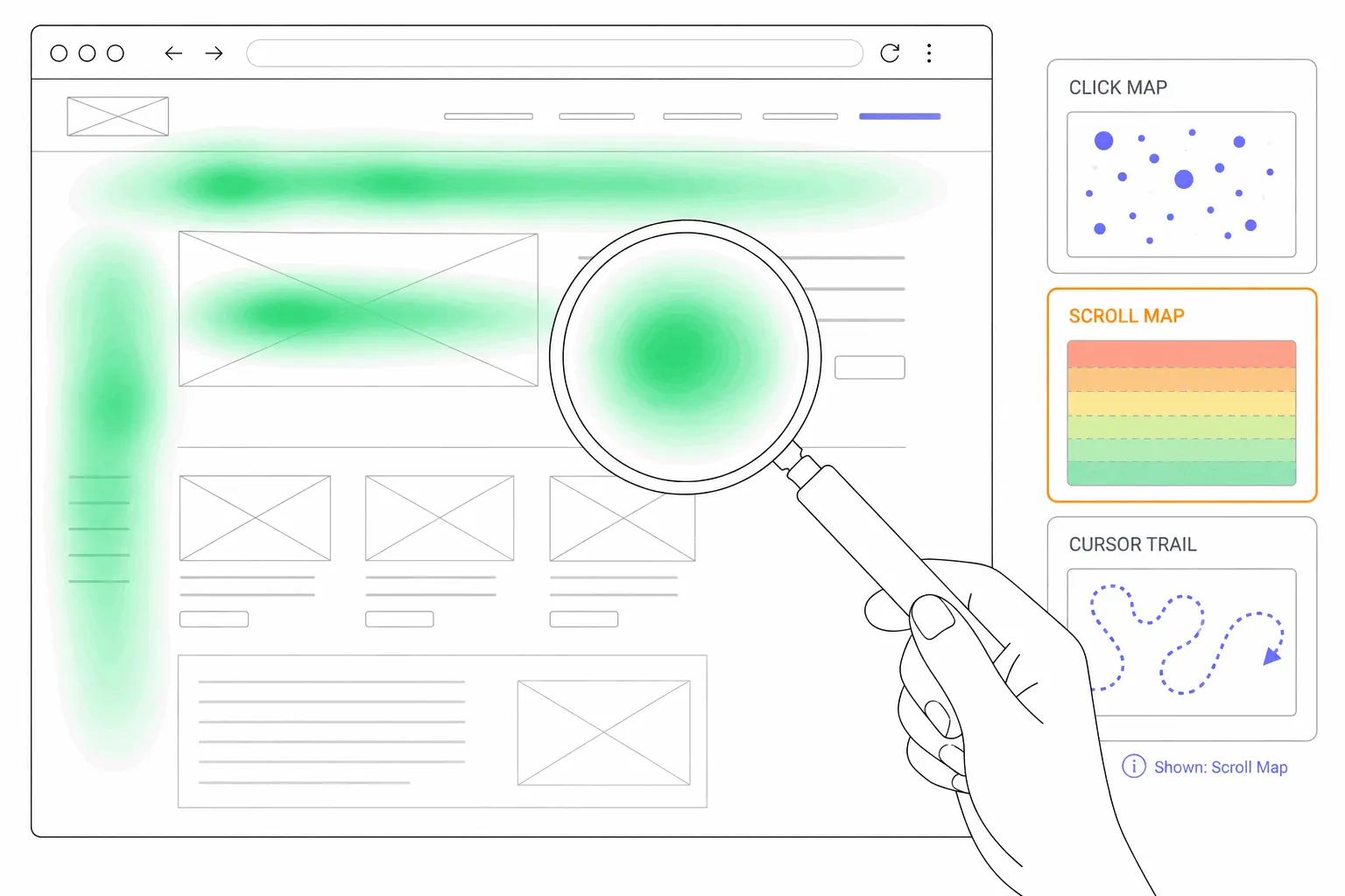
Start with a question, not the colors
A heatmap answers questions; it doesn't ask them. Open one because something specific bothers you - the signup button nobody clicks, the pricing page people abandon in seconds - and the colors either explain it or they don't. Opened without a question, the same picture turns into a Rorschach test: every blob looks meaningful and none of it changes what you do next.
This post assumes you know what a heatmap is and have one in front of you. What follows is how to read it: which numbers to check before trusting anything, what the patterns mean, and where a heatmap stops being the right tool.
Check the sample before the colors
Every heatmap is an average of visits, and averages of small numbers lie. Contentsquare's own heatmap guide recommends collecting 2,000-3,000 pageviews before drawing conclusions - advice worth taking from a company that sells heatmaps. Below that, one enthusiastic visitor's clicking reads as a pattern.
The window matters as much as the volume. A heatmap that spans a redesign averages two different layouts into a picture of neither. Reset the clock after any meaningful layout change, and confirm the map you're reading was collected on the page that's live now.
The scanning patterns behind the hot spots
Most of what a heatmap records is scanning. Nielsen Norman Group's eyetracking research, repeated over more than a decade, keeps landing on the same finding: people rarely read a page word for word. They scan for whatever they came for, and the hot spots are the trail that scanning leaves.
The famous shape is the F-pattern: a full sweep across the top, a shorter sweep further down, then a skim down the left edge. The part most retellings drop is NNG's own caveat - the F is what eyes fall back on when the formatting gives them nothing to grab. If your attention map draws a crisp F over long prose, the finding isn't "users read in an F". It's that your headings and highlights aren't doing their job.
The healthier picture is what NNG calls the layer-cake: horizontal stripes of attention across headings and subheadings, which means the hierarchy is carrying people through the page. A spotted pattern - isolated islands of attention - usually means visitors are hunting one specific thing, like a price or an address. Read the pattern as a verdict on the page's structure, not on its readers.
One bias comes built in: attention leans left. NNG measured roughly 80% of viewing time on the left half of the screen. A cold right rail isn't a failure; it's the default.
Reading a scroll map
Scroll maps come with a base rate that makes raw percentages misleading: attention has always concentrated at the top. NNG's 2010 measurements put 80% of viewing time above the fold; their 2018 update put it at 57%, with the sharp drop after the first screen intact. People scroll more than they used to. The top still wins.
So the finding in a scroll map is never "fewer people saw the bottom" - that describes every page ever measured. The finding is the shape of the decline. A smooth fade is normal. A cliff at one spot is information: visitors decided the page was over right there, usually because the layout looks finished at that point - a full-width image, a band of whitespace, anything that resembles a footer. If the cliff sits above the content the page exists to deliver, that's your fix, and scroll depth numbers will tell you whether it worked.
Reading a click map
On a click map, the two findings worth having are clicks where you expected none and silence where you expected clicks. Clicks on non-clickable things - underlined text, product photos, a graphic that resembles a button - are visitors telling you what they believed was interactive. A cold primary button is the reverse conversation: either they saw it and passed, or they never reached it, and the scroll map settles which.
Click maps have their own deep dive, including the frustration signals - rage clicks, dead clicks, error clicks - that most tools now flag automatically. The analysis rule of thumb: a click map shows what visitors believed about your page, and the gap between their belief and your design is the to-do list.
Segment before you conclude
An unsegmented heatmap averages audiences that behave nothing alike. Mobile and desktop differ in layout, thumb reach and scrolling habits, so a combined map shows a page nobody actually saw - the device split is mandatory. Traffic source is next: someone who clicked an ad three seconds ago and someone arriving from a bookmark scan with entirely different intent.
The practical habit is to read the all-visitors map for orientation only, then re-cut by device before acting on anything. If a hot spot exists in one segment and not the others, the fix belongs to that segment.
What the heatmap can't tell you
A heatmap shows where, never why. Why visitors clicked the photo, why they stalled at the testimonials - the map has no opinion. When why is the question, watch session replays of the exact behavior the map surfaced; that pairing is what the two tools were made for.
Be extra careful with mouse-movement maps. They're often sold as budget eyetracking, on the claim that cursor position tracks eye position - but the research behind that claim is thin, and the correlation appears weaker and more situational than the marketing suggests. Treat a move map as a rough hint and let clicks and scrolls, which record real actions, carry your conclusions.
And a heatmap can't bless a change. It generates the hypothesis; the verdict comes from shipping the change and comparing a fresh map, or from an A/B test when the stakes justify one.
A workflow that holds up
The last step is the one that separates analysis from decoration. A heatmap that never leads to a compared before-and-after was scenery.
The whole method fits in seven steps:
- Write down the question first: which page, which element, what you suspect.
- Check the sample - a few thousand pageviews, all collected on the current layout.
- Read the scroll map for the shape of the decline and any cliff.
- Read the click map for misplaced clicks and cold calls-to-action.
- Split by device, and by traffic source when the page draws mixed intent.
- Turn the strongest pattern into one hypothesis, then watch a handful of replays to check it.
- Change one thing, collect a fresh map, compare.
The practical takeaway
Heatmap analysis is mostly the discipline of not over-reading a colorful picture: enough data, the right segment, patterns judged against how people actually scan, and the why questions handed to replays. The mechanics are the easy part - in Bigdelta, every page gets click, scroll, move and attention maps, split by device and filterable by segment, updating as visits come in. Whatever tool draws the picture, remember it's the start of an argument, not the end of one. The evidence that settles it is what visitors do after you change the page.