What is a website heatmap? The four types, explained
Click maps, scroll maps, movement maps and attention maps answer different questions, and none of them show what people are looking at. What each type is good for, and the reading mistakes that lead to bad redesigns.
Aggregate behavior, painted on the page
A website heatmap is a picture of one page with color laid over it, where the color encodes how much visitor activity each area received. Warm colors — red, orange — mark the spots where many visitors clicked, scrolled to or lingered; cool colors and grey mark the areas that got little or none. The data underneath is real behavior from real visits, aggregated over days or weeks, which is what separates a heatmap from a designer's opinion about where people look.
One heatmap covers one page, on one device type, over one date range. It compresses hundreds or thousands of visits into a single image. That compression is the whole value — patterns invisible in any single visit become obvious — and, as covered below, it's also where heatmaps mislead.
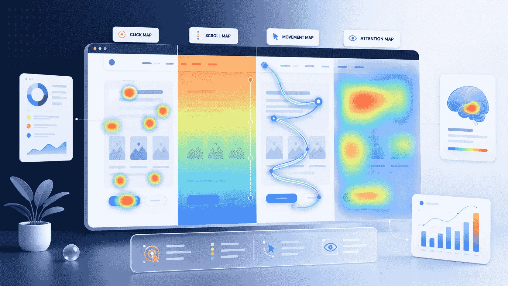
The four types
Click maps show where visitors click or, on phones, tap. They answer which buttons and links get used, which get ignored, and where people click on things that aren't clickable at all — a product photo, an underlined heading — the so-called dead clicks that signal a visitor expected something to happen.
Scroll maps show how far down the page visitors get. The page fades through color bands: the top is seen by everyone, and each band down the page shows the percentage of visitors who scrolled that far. Most tools mark the average fold — the line where the screen first cuts the page off — which makes one check almost mechanical: is anything important sitting below the point where most visitors stop?
Movement maps trace where the cursor travels between clicks. They're the weakest of the four: cursor position correlates with attention only loosely — plenty of people read with the cursor parked at the edge of the screen — so treat movement maps as a hint, never as proof of what was seen.
Attention maps combine the signals — how long each part of the page stayed on screen, weighted by scrolling behavior — to estimate where visitor time actually went. They're the closest a heatmap gets to 'what did people look at', while still being an estimate built from scrolls and time, not from eyes.
How they're made, and how much traffic they need
The tracking script on the page logs each visitor's clicks, scroll depth and cursor positions along with where on the page they landed. The heatmap tool aggregates those events across every visit in the chosen window and renders the totals over a screenshot of the page. Desktop, tablet and mobile are rendered separately, because the same page lays out differently on each — mixing them would paint mobile taps onto desktop coordinates.
Because a heatmap is a statistic, it needs enough visits to mean anything. On a page with thirty visits, the difference between a red spot and a cold one is a handful of clicks — noise wearing a confident color. A few hundred visits per page per device type is a reasonable floor before trusting the pattern; below that, treat the map as anecdote.
What a heatmap can tell you
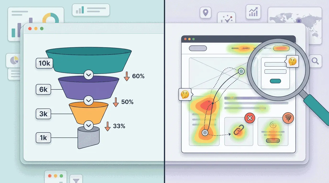
The classic finding is the call-to-action nobody reaches: the scroll map shows 70% of visitors gone before the signup button first appears. The diagnosis matters, because a button can fail two ways — people never reach it (the scroll map's verdict) or they reach it and don't care (the click map shows the area seen but unclicked). The two failures have opposite fixes: move it up, or rewrite it.
Dead clicks are the other reliable catch: visitors clicking product screenshots, icons or headings that look interactive but aren't. Each dead click is a small broken promise, and clusters of them mark exactly where the page's visual language misleads. On content pages, the scroll map doubles as an honesty check on length — if half your readers never see the second section, the second section is where the article actually ends.
The ways heatmaps mislead
The cursor is not the eye. Movement maps especially invite over-reading; a cold area was not necessarily unseen, and a hot cursor trail is not proof of attention. Averages hide segments, too: a heatmap mixes everyone — paid traffic bouncing in seconds, returning customers heading straight for login — into one picture. When a map looks contradictory, filtering by traffic source or segment usually resolves it into two different, coherent stories.
Dynamic pages smear. Popups, carousels, cookie banners and A/B variants all get flattened onto one screenshot, so clicks can appear to land on elements that weren't there for that visitor. And scroll percentages read optimistically: '50% scrolled here' means half the visitors passed this point, not that half read what it says — scrolling and reading are different activities, as average session duration teaches in a different costume. The discipline that protects against all of these: a heatmap finding is a hypothesis. Before redesigning anything, confirm it in a second source — a filtered map, a funnel number, or a handful of recordings.
Heatmap or session replay?
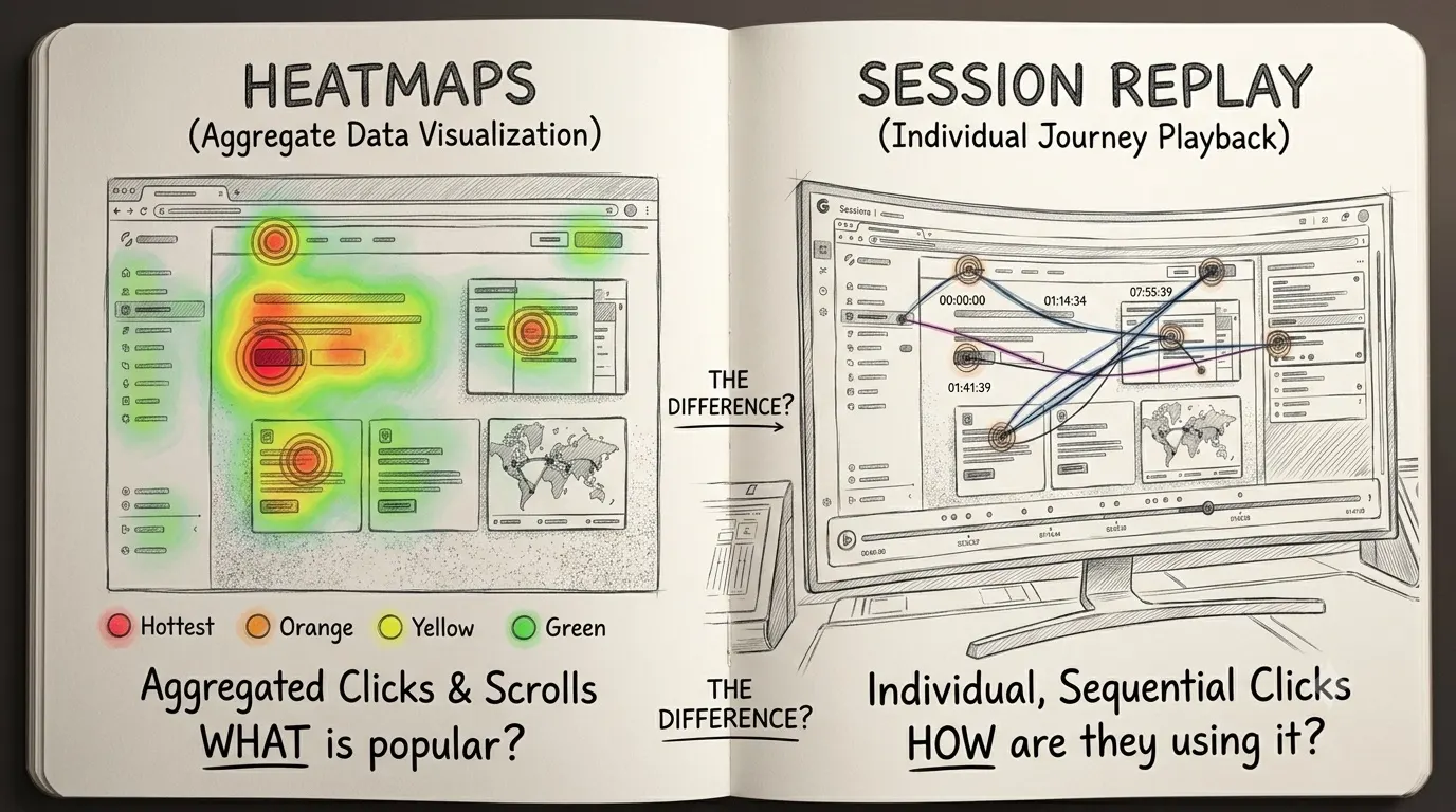
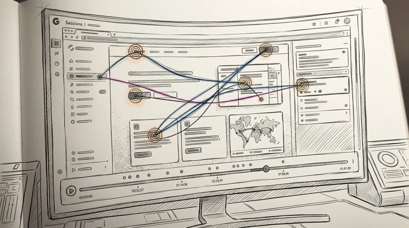
They're built from the same event stream at different altitudes: a heatmap is a census of one page across many visitors; a session recording is one visitor's full visit, replayable end to end. The heatmap finds where something goes wrong at scale; the recordings show what going wrong looks like. The full comparison is in heatmaps vs. session replay, and the workflow that chains them — number, map, recordings, fix — is in how to see where users get stuck.
Heatmaps in UI and UX design
Designers use the same four maps under a different name. A UI heatmap is a click, scroll or movement map read against a product's interface rather than a marketing page: which controls get used, which sit untouched, where people tap on things that are not controls at all. The maps do not change, only the questions do.
In UX work the maps earn their place at two moments. Before a redesign, they show how the current layout is actually used, which settles arguments a mockup cannot. After a change ships, a fresh map on the new layout shows whether the clicks that mattered moved with the button. A movement map is the most design-flavoured of the four, a rough record of hesitation and reading on desktop, and the examples gallery shows the recurring shapes designers look for.
The practical takeaway
Start with the scroll map on the page your business depends on, and check one thing: does anything important live below the line most visitors never cross? Then read the click map for ignored buttons and dead clicks. Treat every finding as a hypothesis, confirm it in a second source, and only then change the page.
In Bigdelta, every page gets click, scroll, attention and move maps from the same one-script install as analytics and replays — rendered separately for desktop, tablet and mobile, updated continuously as new visits come in, and filterable by page, device, traffic source or segment, so the 'filter before you conclude' step is a dropdown rather than a project.