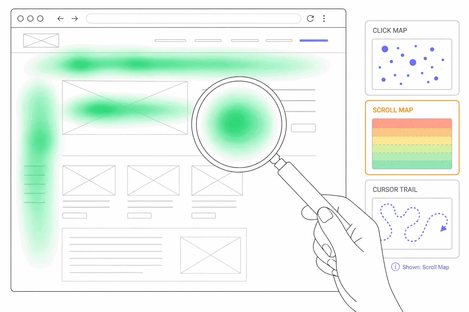
What is a mouse movement heatmap?
A mouse movement heatmap, usually called a move map, shows where desktop visitors moved and rested their cursor on a page. It is a rough guide to where they looked, and this post explains how rough.
What a move map shows
A mouse movement heatmap, usually called a move map, records where visitors move their cursor on a page and paints the result onto a screenshot of it. Places the cursor passed through or rested on show as warm colours. Places it never reached stay cool or blank. It is one of the four types in the website heatmap family, alongside click maps, scroll maps and attention maps, and it is the only one that records something a visitor did without clicking or scrolling.
That is the appeal. Most of what people do on a page leaves no trace in analytics. They read, hover, hesitate and move on. A move map catches some of what happens between the clicks, on desktop at least.
How a move map is built
The tracking script on the page notes the cursor's position at short intervals while the visitor is on the page. A research setup at Google in 2007 recorded the cursor every tenth of a second, along with the page element under it, and commercial tools work on the same principle. Each sample is tied to an element or a small grid cell rather than to a raw pixel, so the map still lines up when the page is wider on one screen than on another.
Then the samples from every desktop visit in the chosen period are added together. Most tools weight a spot by how long cursors stayed on it, so a place where many cursors paused turns red before a place many cursors merely crossed. One vendor's guide puts it directly: the longer a cursor remains at a point, the redder it becomes. Other tools weight by the density of movement instead. The difference matters when you read the map, because a red patch can mean visitors lingered there or that they passed through it on the way to something else.
Does the cursor follow the eye?
The idea goes back to a small study by Mon-Chu Chen, John Anderson and Myeong-Ho Sohn at Carnegie Mellon, presented at the CHI conference in 2001. They recorded gaze and cursor from five people browsing the web and found a strong relationship between the two, with the cursor sitting closer to the gaze in the parts of a page people were paying attention to. That paper is the source of most of the "mouse follows the eye" claims on vendor sites. Five people is a thin base for a rule.
Kerry Rodden and colleagues at Google ran a larger study, published in 2007 and 2008, with 32 participants doing search tasks while an eye tracker and a cursor logger ran together. Eye and mouse were in the same region of the page at the same moment for a little over two in five cursor samples. The typical gap between the two was about 190 pixels. The team found three distinct ways people use the mouse actively: running it under text while reading, moving it down the page level with where they are reading, and parking it on a promising result while the eyes keep scanning. In most visits, though, the mouse was only used to click. The rest of the time it rested wherever it had been left, often in the blank space beside the results.
Jeff Huang, Ryen White and Georg Buscher at Microsoft Research went further in 2012 with 36 people and 32 search tasks. The cursor sat idle for nearly three fifths of all the time recorded, and while it was idle the eye roamed freely, typically around 230 pixels away. When people were actively moving the cursor to read, the gap shrank to about 150 pixels. In the moment before a click it was under 80. The authors' conclusion was blunt: claiming that the cursor approximates the gaze is misguided, because whether it does depends on the moment and on what the visitor is doing.
Nielsen Norman Group, which has run eye-tracking studies for two decades, says much the same in fewer words. Its May 2026 guidance for UX writers describes cursor-based heatmap tools as a source of useful directional data and a very rough approximation, and adds that they cannot tell you which text people actually read.
What that means when you read one
Put together, the research supports a modest claim. A move map is a fair record of what people did with their mouse and a rough hint about where they looked. It is at its most reliable in two situations: when the cursor is moving, and just before a click. It is at its least reliable when the cursor is still, which is most of the time.
So read a move map for shape rather than precision. A warm band along a paragraph means people ran the cursor along it, which usually means they were reading it. A warm patch on a price or an image means cursors rested there, which often means interest and sometimes means the visitor parked the mouse and read something else. A cold region means cursors never went there, and that is the safest reading of all: whatever sits there, nobody engaged with it by mouse.
How an attention map differs
Some tools offer an attention map next to the move map, and the two are easy to confuse. A move map records where cursors went. An attention map estimates how long each part of the page was in front of the visitor, usually from a mix of how far they scrolled, how long each section stayed on screen and, on desktop, where the cursor rested. Warm colours mean more time. One vendor's documentation defines its attention map purely as time spent per section of the page, with cursor movement playing no part at all.
An attention map is often the better of the two for content pages, because it works on mobile as well, where there is no cursor to track. The move map is better when the question is about one element: did people hover over this button, hesitate on this field, run the mouse along that line. Bigdelta, for example, offers both, and describes its move maps as tracking cursor movement as a proxy for reading on desktop and its attention maps as weighting each area by how long visitors spend on it.
Why there is no move map on mobile
A phone has no cursor. Touch registers when a finger meets the glass, so the page only learns about a tap or a scroll. There is no hover and no path across the screen towards a button. A move map for mobile traffic would be blank, and most tools do not offer one.
What replaces it is a tap map, which is the mobile form of the click map, and a scroll map. Between them they cover most of what a move map would have told you. If half your traffic is mobile, check those before you spend time on the move map, and remember that the desktop move map describes only your desktop visitors. Most tools keep the device maps separate for that reason.
Patterns a move map shows
A few shapes come up on almost every site.
The one to act on first is hovering without a click. A visitor who hovers over something and does not click is telling you the element looked interactive or the next step was unclear. A click map of the same page will usually show dead clicks in the same spot, and the frustration signals post covers what to do about them.
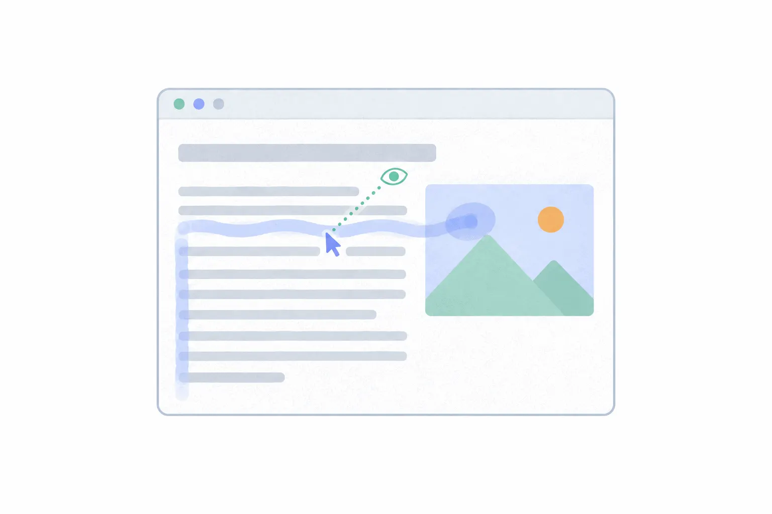
- Horizontal streaks across text. Visitors ran the cursor under a line as they read it. Rodden's team saw a minority of participants do it, a few of them in most tasks. It is a good sign for that paragraph.
- A vertical trail down the margin or the blank space beside the content. The cursor moved down the page level with the reader's place, or rested there while they scrolled with the wheel. It says nothing about the margin itself.
- A warm patch on a price, a product image or a headline. Cursors paused there. Usually interest, occasionally a parked cursor.
- Warmth in the top corner where the cursor sat when the page loaded, and around the browser's own controls. Ignore it.
- Hovering on a form field, a button or a card without a click. Hesitation, or an element that looks clickable and is not.
When to open a move map instead of a click map or scroll map
Open the click map first when the question is whether people used what you built. Open the scroll map first when the question is whether they got far enough down to see it. Open the move map when both of those look fine and something still is not working: the button is visible and nobody clicks it, or a paragraph sits in the middle of the page and you want to know whether anyone reads it. The move map is also the one to check when you suspect a page is confusing, because hesitation shows up as hovering, and hovering shows up nowhere else.
Common misreadings
Most mistakes with a move map come from asking it for more than it can give.
Read it like any other heatmap: enough visits, one device at a time, and a second source before a redesign. How to analyze a heatmap covers that routine, and website heatmap examples shows what the common patterns look like once they are on a real page.
- Reading warmth as interest. A cursor can rest on a spot for a minute while the visitor reads the next column. Check the attention map or a few recordings before acting on a hot spot.
- Reading a map built from too few visits. One vendor's guide suggests a few hundred desktop sessions per page before the pattern settles. Until then the map is a handful of people's mouse habits.
- Mixing devices. A move map built from all traffic is a desktop map diluted by blank mobile visits. Set the device filter to desktop.
- Treating it as eye tracking. The studies above put the typical gap between cursor and gaze at a couple of hundred pixels, which is wider than most buttons.
- Comparing maps across a redesign. Once the layout changes, old samples land in the wrong place. Start a fresh date range.