Heatmaps vs analytics: what a heatmap adds to your page view reports
An analytics report and a heatmap keep different records of the same page. What each one stores, three pages where the two disagree, and how much traffic a heatmap needs before it is worth adding.
What an analytics report records about a page
Open any page in a web analytics tool and you get a row of numbers. Google Analytics 4's Pages and screens report, for example, gives each page its views, active users, views per active user, average engagement time, event count, key events and total revenue. Other tools use different names for the same ideas: how many people came, how long they stayed, what they did next, and whether they converted. What web analytics is covers the basics.
Everything in that row is a count or an average across the whole page. Scrolling is a good example. Google Analytics records one scroll event per page view, fired the first time 90 percent of the page comes into view, so the report can say what share of visits reached the bottom and nothing about the stretch in between. A click only shows up if someone defined an event for that link or button in advance. Clicks on anything else are not recorded.
That is the strength and the limit of the format. Counts can be compared: this week against last, search visitors against paid, one landing page against another. What they cannot do is say where on the page any of it happened.
What a heatmap records about a page
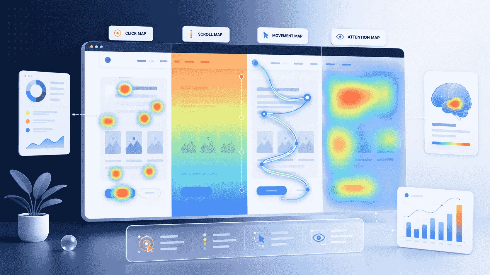
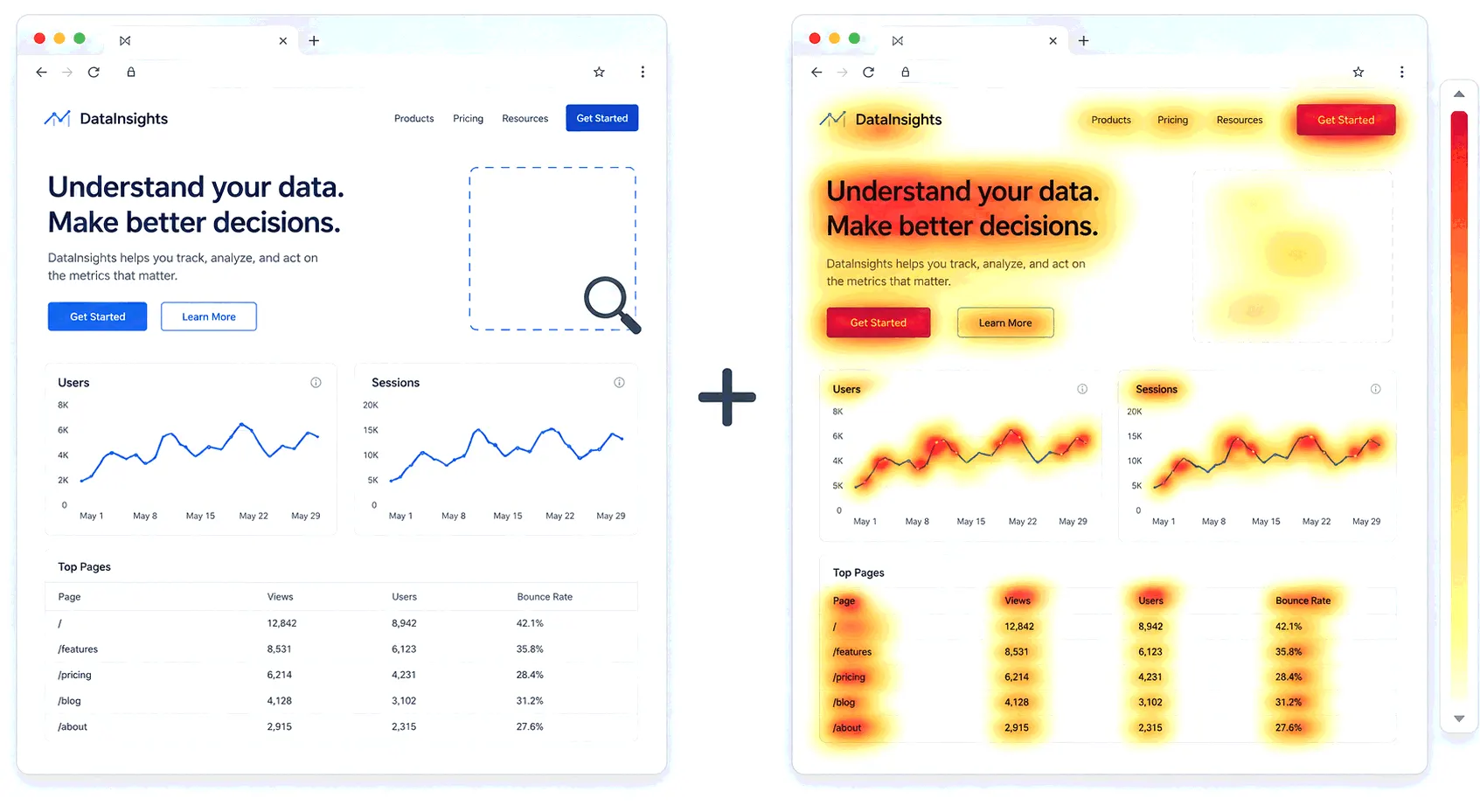
A heatmap records position. The script on the page notes where each click or tap landed and which element was under it, how far down each visit scrolled, and on desktop, where the cursor moved. The tool then paints those positions onto a screenshot of the page, warm colours where activity piles up and cool colours where it does not. What a website heatmap is describes the four map types.
So a heatmap is a picture of one page on one device type, built from every visit in the date range you chose. It records interactions nobody planned for, because it captures every click rather than the ones with an event attached. And it shows the page the way visitors saw it, which is what makes a layout problem visible.
The trade-off is the reverse of the analytics row. A picture is hard to compare week to week, hard to segment across many pages at once, and useless for revenue. The three cases below put the two records side by side.
Case 1: the landing page with a fine bounce rate
A landing page for a paid campaign shows a bounce rate in line with the rest of the site. Google Analytics counts a session as engaged when it lasts more than ten seconds, includes a key event, or includes two or more page views, so most visitors here are clearing the ten-second bar and the page looks healthy. Yet the signup button gets almost no clicks and the campaign is not converting.
The click map for the same page shows why. The hottest spot is a product screenshot halfway down, which is not a link. The button below it is nearly cold. Visitors are trying to interact with the image, getting nothing, and leaving. The analytics never recorded those clicks because nobody set up an event for an image that was never meant to be clicked. Nielsen Norman Group's 2017 eyetracking study of 71 people found that on pages with weak click cues, participants spent about a fifth longer finding what they needed, and some stopped at a section heading they took to be a link and never reached the real one. A dead click on a heatmap is the everyday version of that finding. What a click map is explains how those clicks are counted.
Case 2: the article with a long engagement time
A long guide shows one of the highest average engagement times on the site, and the scroll event says a minority of visits reached the bottom. Both numbers are true. Neither says where everyone else stopped.
The scroll map does. It shows the page going cold at roughly the 40 percent mark, right under a full-width image with a heading beneath it. The layout looks like the end of the article, so readers treat it as one. This is a false bottom, and it is one of the most common shapes on a scroll map. Website heatmap examples has a gallery of it and nine others.
Some drop-off is normal. Nielsen Norman Group's 2018 eyetracking study of 120 people found that just over half of viewing time went to the first screen and about three quarters to the first two screens, even though people scroll more than they used to. A scroll map will always be warmer at the top. The thing to look for is a cliff rather than a slope, and the analytics row cannot show either.
Case 3: the pricing page people leave from
Analytics shows the pricing page as one of the top exit pages, with exits rising after the plans changed last month. That dates the problem and shows which traffic sources leave most, without saying what on the page people looked at before they went. Exit rate vs bounce rate explains what an exit does and does not mean.
The move map and click map fill that in. On desktop, cursor movement clusters over the feature list of one plan, and clicks land on a feature name that looks like it should expand and does not. On mobile, the click map shows taps on the plan cards themselves rather than the small button at the bottom of each. The heatmap has turned "exits rose" into two specific things to fix, and the analytics will say next month whether the fix worked.
What analytics does that a heatmap can't
- Compare over time. A count from last week sits next to this week's. Two heatmaps of the same page can be compared by eye, and only roughly.
- Follow visitors across pages. Funnels, paths, entrances and exits all connect one page to the next. A heatmap knows about one page.
- Attribute. Traffic sources, campaigns, referrers and revenue live in analytics. Most heatmap tools can filter a map by source, but the source data comes from the analytics side.
- Work with little traffic. Ten visits is a number you can read. Ten clicks is not a pattern.
What a heatmap does that analytics can't
- Record the unplanned. Every click and tap, on links and on things that are not links, without anyone defining an event first.
- Show scroll depth as a curve down the whole page instead of a single event at 90 percent. Scroll depth tracking covers what the curve looks like.
- Put the behaviour on the layout. Tools keep a separate map for the phone-width layout and the laptop-width layout, because a tap at the top of one and a click at the top of the other land on different elements.
- Show hesitation. On desktop, cursor movement is a rough proxy for where people are reading, and no analytics report has a column for that.
How much traffic each one needs
An analytics count is usable from the first day. A heatmap is not, because a pattern needs enough visits to separate from noise. One conversion-testing vendor's playbook puts a click map at about 200 to 300 visitors before patterns show and 500 sessions before drawing a conclusion, and a scroll map at around 200, with every figure counted per device type. A hundred desktop visits and a hundred mobile visits make two small samples.
Both records undercount for the same reasons, mainly ad blockers and declined consent. Dark traffic covers how much goes missing. For a heatmap the loss matters more, because it pushes a small page further below the point where the picture means anything.
Cost, privacy and Google Analytics
Google Analytics has no heatmap of its own, so a heatmap always means a second product, and usually a second script on the page. Does Google Analytics have heatmaps walks through what it offers instead. Some tools bundle the two. Bigdelta, for example, builds heatmaps from the same script and data as its analytics, so a heatmap opens from any page in the reports and a high bounce rate can be read next to the scroll map for that page.
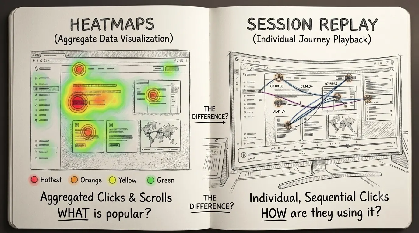
Privacy questions are lighter for heatmaps than for replays. A heatmap stores where clicks landed and which element took them, not who clicked. In Bigdelta's case, form fields and payment inputs are never captured. A session replay reconstructs individual visits, which raises different questions, and heatmaps vs session replay covers that difference.
The routine: number first, map second, replay third
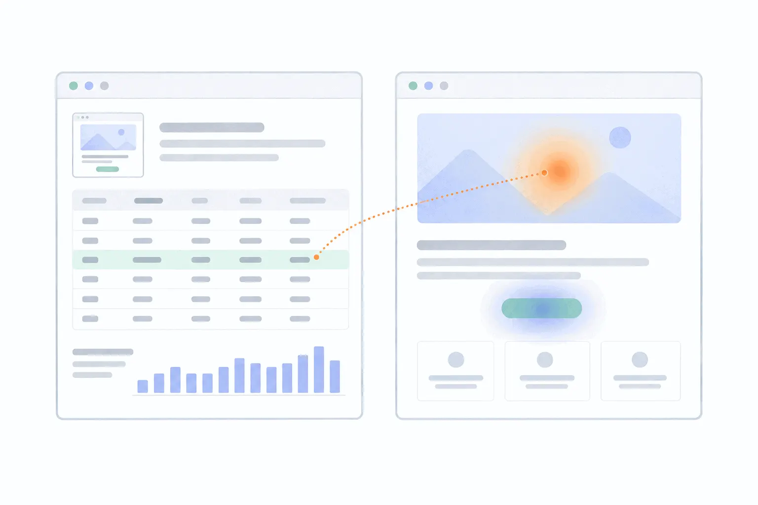
The order that works is to let the analytics pick the page and the heatmap locate the problem on it. A page whose conversions fell, or a landing page bouncing worse than its neighbours, comes from the report. Open the map for that page and that device, wait until it has enough visits, and look for the shape. How to analyze a heatmap covers what counts as enough and how to avoid reading noise. If the map shows a hotspot you cannot explain, watch a handful of recordings behind it. That is the whole of website behavior analytics in three steps.
Who needs which is mostly a traffic question. A site with a few hundred visits a month can run on analytics alone, because none of its pages will fill a heatmap. Once the important pages, usually the home page, a landing page or two, pricing and checkout, each pass a few hundred visits a month per device, a heatmap on those pages starts paying for itself. A blog with a thousand posts does not need a thousand heatmaps. It needs five, on the pages the analytics say matter.