What is UX analytics?
UX analytics is the practice of measuring how real people experience an interface. The four design questions it answers, the metrics worth a dashboard, and the loop that turns numbers into design decisions.
What UX analytics means
UX analytics is the practice of measuring how real people experience an interface, and using the measurements to decide what to change. The raw material is behavioural data: clicks, scrolling, form entries, flows finished and flows abandoned, collected from everyone who uses the site rather than from a test panel.
It is the quantitative half of UX research. Nielsen Norman Group's framing from 2017 still holds: quantitative methods answer how many and how much, qualitative methods answer why. A usability test with six people shows you what confuses them. UX analytics shows how often that confusion happens in the wild, and to whom.
The data layer underneath, the heatmaps, session replays and events, is covered in what website behavior analytics is. This post is about the practice built on top: the four design questions the data can answer, the numbers that deserve a place on a UX dashboard, and the routine that turns them into design decisions.
Do people find it?
The first question of any interface is whether people can find the thing they came for. Analytics answers it with navigation data: which menu items get used, which get skipped, and what people do when the menu fails them.
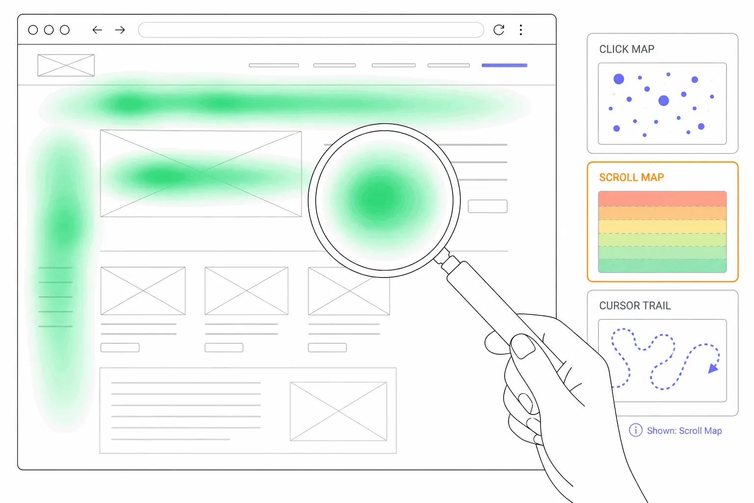
A click map shows the finding behaviour on one page: the links that carry the load, the buttons nobody touches, and the unclickable elements that draw taps anyway, each one a small note from a visitor about where they expected a door. Site search is the other findability instrument. People type into a search box what they could not find by looking, so the search log is a ranked list of navigation failures.
Do they read it?
Content has its own question: did anyone get past the first screen. Scroll depth answers it with the share of visitors reaching each point on the page, and the depth where that share collapses is usually a layout problem rather than a boredom problem. A page element that looks like an ending stops readers who would have continued.
Attention maps refine the picture by weighting each section by time rather than by arrival, which separates the paragraph people read from the paragraph they merely scrolled past. For a designer the practical output is placement: whether the thing that matters sits where attention actually lands.
Can they use it?
Usability defects leave fingerprints in behavioural data. The clearest are frustration signals: rage clicks on controls that respond too slowly, dead clicks on things that look interactive and are not, error clicks where the code failed. Each one is a usability test finding that surfaced on its own, from the live product, without a lab.
Forms deserve their own instruments, because they are where interfaces lose the most people quietly. Form analytics shows which field visitors hesitate on, which one they abandon from, and how many who started never finished. A form that loses half its starters is a usability problem with a street address.
Do they succeed?
The end-to-end question is task completion: of the people who set out to do the thing, how many did it. In lab research this is measured as a success rate over a handful of participants. On a live product the same idea is a funnel: the ordered steps of the core task, and the share of people passing each one.
Time is the second read on the same question. A flow people complete slowly often has the same defect as a flow people abandon, caught earlier. If a checkout that took two minutes in spring takes four in autumn, something in between started fighting the customer.
The UX metrics worth tracking
Four numbers cover most of the practice, each tied to one question above:
Standard analytics metrics make poor UX metrics on their own. A high bounce rate can mean a confusing page or a question answered instantly. A long session duration can mean absorption or someone lost. Those numbers earn attention only next to a task-shaped one.
- Flow completion rate for each core task, from a funnel with the task's real steps. The headline UX metric, and the one to baseline first.
- Frustration signals on key flows: rage clicks, dead clicks and error clicks counted per page or per element, watched as a trend rather than a total.
- Form abandonment rate on the forms that matter, ideally with the losing field named.
- Time to complete the core action, read as a median so a few idle tabs do not distort it.
Where recordings and interviews fit
The metrics locate problems without explaining them. A completion rate that fell names the flow, a frustration count names the element, and neither says what the visitor was thinking. That is the qualitative half's job, and the practice works as a loop between the two.
The cheap qualitative step is watching recordings of the sessions behind a bad number: three or four replays of visitors who abandoned the flow usually reveal the shape of the problem. The thorough step is research with actual people. NN/g's distinction is worth keeping in mind here: a handful of observed users gives a direct reading of what is hard to use, while analytics gives an indirect one at scale. The numbers tell you where to point the small, expensive instrument.
Does performance count as UX analytics?
Yes, as its own corner. Google's Core Web Vitals measure three experience qualities from real visitors: how fast the main content appears, how quickly the page responds to input, and how much the layout shifts while loading. Google's own framing is that the metrics exist to quantify the experience of a site. The thresholds and where to read them are covered with the other search-facing metrics.
Performance also leaks into the behavioural numbers. A slow button collects rage clicks from people who clicked once and lost faith, so a frustration spike is sometimes a latency problem wearing a design problem's clothes.
Running it as a practice
Start with two flows, not twenty: the task the site exists for, and the runner-up. Define the events that mark each step, baseline the four metrics over a full month, and write the numbers down. From then on the routine is small. Glance weekly, check after every release, and segment by device before concluding anything, since a mobile-only regression hides inside an average.
When a metric moves, run the loop: segment to find who, watch a few recordings to see what, and change one thing before measuring again. The discipline is the same one every measured practice uses, and the point is that design arguments get settled by the next release's numbers rather than by the loudest voice.
One scope limit is worth naming. Analytics shows struggle, and struggle sometimes points at accessibility problems, but behavioural data cannot certify that an interface works with a screen reader or a keyboard. That check is an audit, not a metric.
Do you need a UX analytics tool?
Mostly you need the data you already collect, pointed at design questions. Teams assemble UX analytics from their web analytics plus a behaviour tool, and increasingly those are the same product. Bigdelta, for example, ships analytics, heatmaps and session replays from the same snippet.
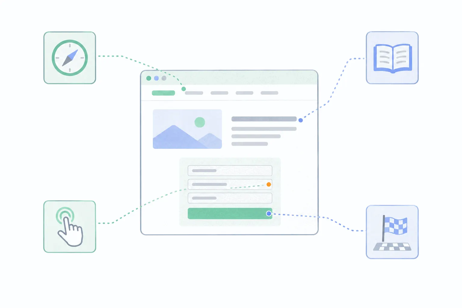
However the stack looks, the practice is the four questions. Pick the core flow, ask whether people find it, read it, use it and finish it, and let the answers choose the next redesign. An interface improved that way gets better in the places visitors actually struggle, which is the whole promise of the discipline.