Heatmap dashboard: which heatmaps to keep in view
A heatmap dashboard is the short set of maps you actually review. Which five pages earn a standing heatmap, which map type fits each page, how often to look, and how to report what you find.
What is a heatmap dashboard?
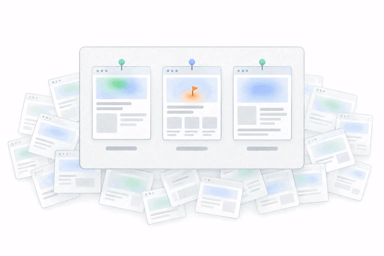
Most heatmap tools no longer make you create heatmaps one at a time. The script collects clicks and scrolling everywhere it runs, so a map exists for every page the moment you ask for it, and some tools draw maps for your busiest pages before you ask. The result on most sites is fifty maps and no habit of looking at any of them.
A heatmap dashboard is the fix: a short, deliberate set of maps you return to, on the pages where a change in behaviour would change a decision. In most tools it is a list of pages with a map behind each one, plus filters, and in some tools a compare view, saved audience segments, or a board you can pin maps to. Bigdelta, for example, opens a heatmap straight from any page in your analytics and filters it by page, device or traffic source. The tool matters less than the choice of pages.
The five pages that earn a standing heatmap
Five standing maps cover most sites. If the set grows past seven or eight, it has stopped being a dashboard and gone back to being the pile.
- The money page. Pricing on a SaaS site, the top product page on a store, the booking or contact page on a service site. Behaviour here moves revenue, so this map earns the most frequent look.
- The top landing page from search. Visitors arrive cold, and the map shows whether the page earns their attention before they leave.
- The highest-traffic page, usually the home page. Its map stabilises fastest because the numbers are largest, which makes real changes easiest to spot.
- The leakiest step in your funnel. When funnel analysis points at one page where visitors with intent give up, that page keeps a map until the leak closes.
- Anything just redesigned. A fresh map on a new layout checks whether the clicks that mattered survived the move. Keep it for a month or two, then retire it.
Which map type to keep per page
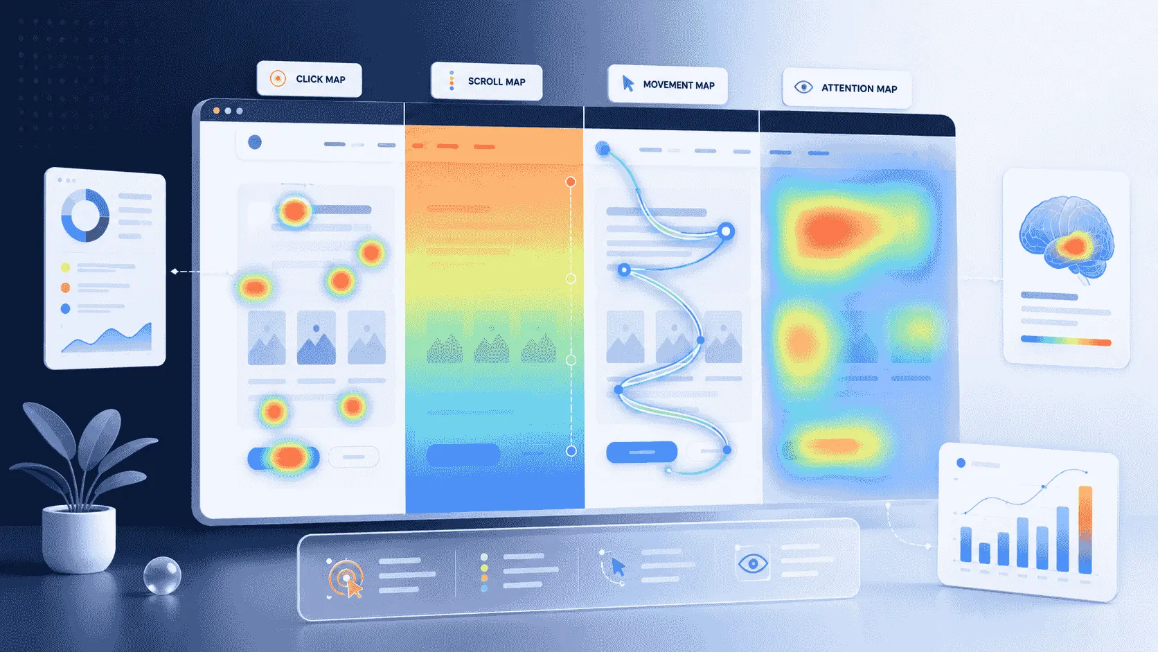
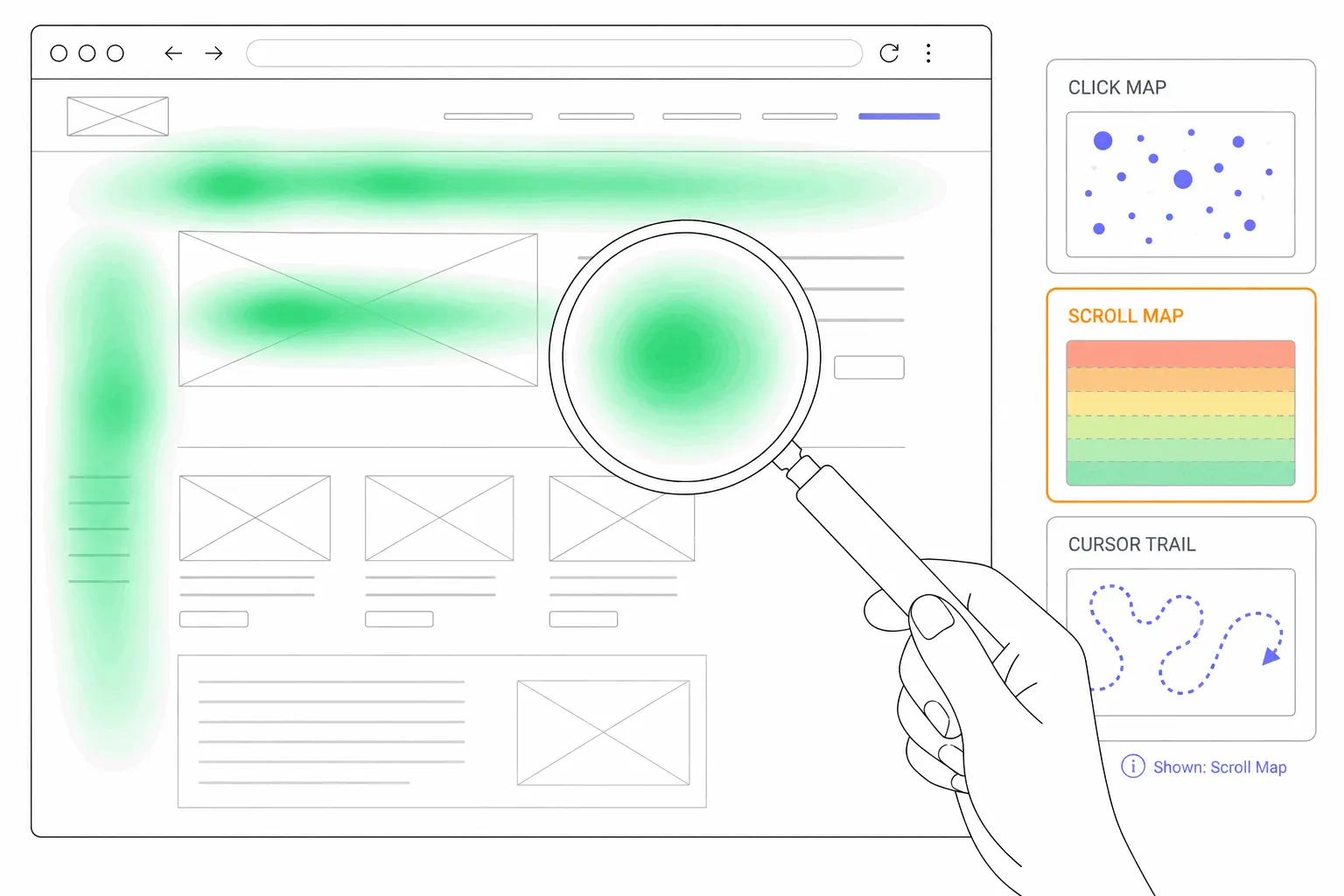
One map type per page is enough for the standing set. The four types answer different questions, and the page's job picks the type. A landing page or an article lives on whether people keep reading, so keep the scroll map. A pricing page, a home page or anything navigation-heavy lives on what people click, so keep the click map.
The other types are open-on-demand. A movement map earns a look when clicks and scrolls both look fine and the page still underperforms. Keep the standing set boring, and open the rest when a question calls for them.
How often to look
Monthly per page is enough. A map is hundreds of visits averaged together, so it changes slowly, and next month's crowd behaves much like this month's. The exception is a release: any change to one of the five pages gets a fresh read once enough visits have collected on the new layout.
Know what a real change looks like before reacting to one. Normal wobble is a hotspot a shade warmer or a scroll line a few percent higher. A real change is categorical: a button that was hot going cold, a new cluster of clicks on something unclickable, the scroll drop-off moving above your call to action. How to analyze a heatmap covers telling the two apart, and checking the visit count before trusting either.
Reporting heatmaps to a team or client
A heatmap earns its place in a report as evidence next to a number, and it is one of the few analytics artefacts a non-analyst reads instantly. "Exits on pricing rose" is a claim. The same sentence beside a click map with taps piled on an unclickable plan card is a finding.
The format that works is a screenshot of the map, the number it explains, and one sentence on what you will do about it. One insight per map. Most tools can download a map as an image for exactly this, and the screenshot also freezes the evidence, since a live map keeps collecting and will not show next month what it shows today. The web analytics report post covers the report around it. In Bigdelta's case you can also send a heatmap and the matching replay to your team, so the picture and the proof travel together.
Does a heatmap belong on a metrics dashboard?
Mostly no. A dashboard of numbers is for glancing: is anything off this week. A heatmap is a diagnostic you open on a question, and it rewards minutes rather than glances. Pinning a live map between the traffic chart and the conversion rate invites reading noise as signal, because nobody checks a sample size mid-glance. Keep the maps one click away from the analytics dashboard, and let the numbers decide when a map gets opened.
Mistakes that defeat the dashboard
Standing maps on pages nobody decided anything about. If no decision hangs on the page, the map is decoration. Retire it.
Screenshots from thin maps. One conversion-testing vendor's playbook puts a click map at a few hundred visits per device before patterns mean anything, and around 500 sessions before drawing conclusions. A confident-looking screenshot built on thirty visits is the fastest way to ship a wrong conclusion to a client.
Comparing maps across a redesign. Once the layout changes, the old map describes a page that no longer exists. Compare before and after on numbers, and start the new map's history at the release.
Mixing devices. Pick one device per page for the standing set, usually the one with more traffic, and note the choice so the monthly look compares like with like.
Start with three
If five feels like ceremony, start with three: the money page, the top landing page, the leakiest funnel step. Put a monthly reminder against them, screenshot anything that changed, and let the set grow only when a new decision needs watching. Three maps looked at monthly beat fifty collected forever.
---