How to build a web analytics report
The periodic report is the analytics habit that reaches people who never log in: a one-page snapshot with the numbers, what they mean, and what to do next. What goes in one, and the free tools that send it for you.

A report is not a dashboard
A web analytics report is a periodic snapshot: the numbers for a fixed window, prepared on a schedule, sent to people who don't open the analytics tool themselves. Its sibling, the dashboard, is the live view you check yourself. The two get conflated constantly, and the confusion has a cost - teams share a dashboard link, call it reporting, and wonder why nobody downstream knows what the website is doing.
The difference is the reader. A dashboard assumes someone who knows the context and wants the current state. A report assumes someone who has been elsewhere for a month and needs the story: what happened, why, what we're doing about it. That third part is what a dashboard can never contain.
What belongs in one
That's the spine. The full metric menu exists when a reader asks for more, but resist starting there - every metric you add dilutes the ones that matter.
A report that fits on one page beats a thorough one that doesn't get read. Five sections cover nearly every audience:
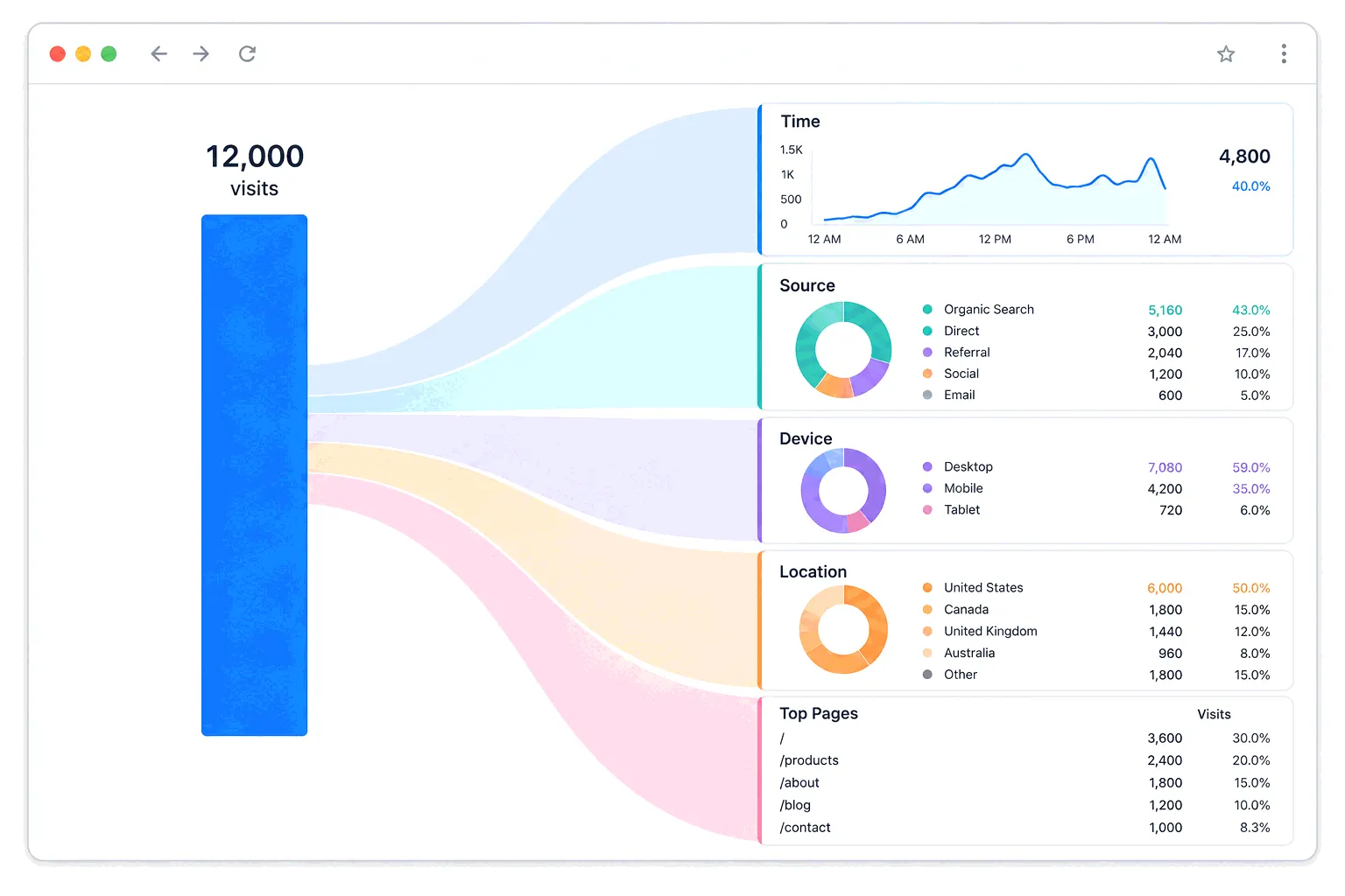
- Traffic overview - visitors and sessions for the period, next to the previous period and the same period last year. The comparison is the content - a number alone means nothing.
- Traffic sources - the split by channel, and which channel moved. This is where the marketing effort shows up, so it's usually the section stakeholders actually read.
- Top pages - the five or ten pages doing the work, plus anything new that entered the list.
- Conversions - the count and rate of whatever the site is for. If conversion tracking isn't set up, this section reads "not measurable yet", which tends to get it set up.
- One engagement number - bounce rate or engagement rate, as a health check. Stable earns a sentence, a jump earns a paragraph.
The sentences matter more than the charts
The difference between a data dump and a report is interpretation. Each section needs a written line under the number: "organic is up 12% since the pricing guide started ranking" tells the reader something. A bar chart alone asks them to do your job. End with two or three actions the numbers point at. If a period genuinely has no story, one honest sentence saying so beats a manufactured one.
Comparisons deserve care, because they're where reports quietly lie. A 28-day month against a 31-day one produces a built-in 10% drop. Seasonal businesses need the same month last year, not last month. Honest traffic analysis is its own skill, and the report is where it either happens or visibly doesn't.
Sending it straight from GA4
GA4 can email reports on a schedule - daily, weekly, monthly or quarterly - from any standard report view. The limits: only administrators can schedule, a property holds at most 50 scheduled reports with 50 recipients each, and the Realtime view can't be scheduled. One detail from Google's own docs worth copying: data can arrive up to 72 hours late, so a monthly report scheduled for the 1st reports an incomplete month - Google suggests the 4th.
For manual sends, GA4 exports any report as PDF, CSV or straight to Google Sheets. The scheduled email covers the "numbers on time" half of reporting. The interpretation half still has to be typed by someone.
Looker Studio, the free report builder
When the built-in formats don't fit - a client wants their logo, a director wants Search Console and analytics on one page - the standard free answer is Looker Studio, Google's drag-and-drop report builder. It costs nothing, connects to GA4 natively, pulls Search Console and Google Ads into the same page, and delivers finished reports by scheduled email. Most paid reporting tools are, at heart, a more polished version of this with support.
Worth knowing before you start: Search Console and GA4 will disagree on the same page of your report. Put a one-line footnote explaining why, or field the same question every month.
How often to send it
There is no industry-standard cadence, whatever a template vendor implies - we looked for a credible study and found none. The useful rule is to match the report to the decisions it feeds: weekly suits a team actively spending on campaigns, monthly suits most businesses, quarterly suits owners and boards. The wrong cadence announces itself. Reports nobody mentions are too frequent, and "wait, when did that happen?" means too rare.
The practical takeaway
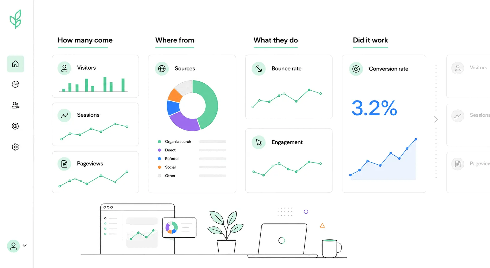
One page, five sections, a sentence of interpretation under each number, two actions at the end, sent on the schedule your decisions run on. The numbers can come from any tool - Bigdelta keeps the headline set on one screen, which makes the monthly writing session a ten-minute job - but the report itself is the discipline of turning them into sentences. It's the cheapest analytics habit there is, and the one that makes the rest visible to everyone who doesn't log in.