Heatmaps for marketers: what campaign traffic does on the page
Analytics says which campaign brought visitors and whether they converted. The heatmap covers the page in between: where paid traffic clicked, how far it read, and what it walked past.

What a heatmap shows, in one paragraph
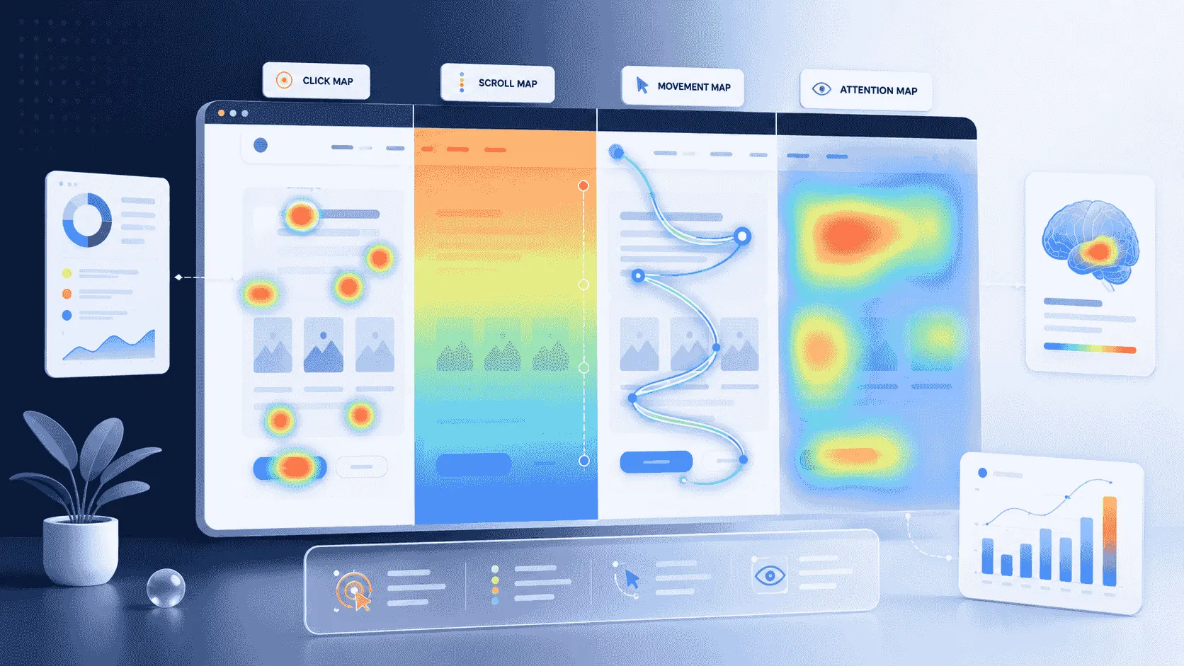
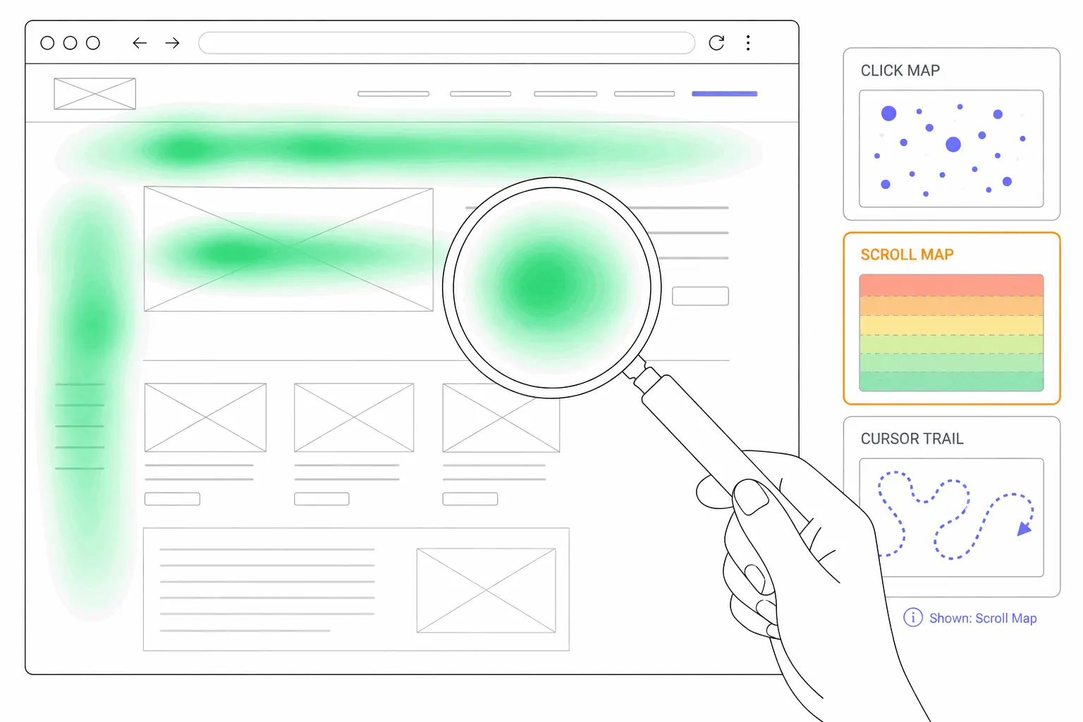
A heatmap is a picture of aggregated visitor behaviour laid over a page: warm colours where many people clicked or lingered, cold where few did. Click maps show what gets clicked, scroll maps show how far people get, and most tools draw both from the same script. If the idea is new, what a website heatmap is covers the types properly. For marketing work the definition matters less than the question you bring to the map, so the rest of this post is about the questions.
The landing page check
The most common marketing use is the simplest. A campaign sends paid traffic to a landing page, the conversion rate is disappointing, and the funnel report says only that people left. The heatmap says where the attention actually went.
Two patterns show up over and over on paid landing pages. The scroll map shows most visitors never reached the thing the ad promised, because it sits below where they stopped reading. Or the click map shows a hotspot on something that is not the call to action, an image that looks clickable, a navigation link that leads away, a second offer that competes with the first. Neither pattern is visible in conversion numbers, and both have obvious fixes: move the promised thing up, or take the competing click away.
The same check works as message match. The ad made a specific promise, and the heatmap shows whether the page delivers it where arriving visitors actually look. When the headline restates the promise and the hotspots sit on the matching call to action, the page and the ad agree. When the hotspots wander, the page is answering a different question than the ad posed.
Split the map by traffic source
An aggregate heatmap averages everyone together: paid, organic, email, returning readers, people who typed the address. For a marketer that average hides exactly the thing being managed, because visitors from different channels arrive with different intent and behave differently on the same page.
Paid visitors are cold. They clicked an ad seconds ago, know nothing about the site, and give the page one short chance. Organic visitors chose a search result and often scroll further. Email subscribers already know the brand and skip the introduction. One page, three behaviours, one blended map that describes none of them.
Most heatmap tools can filter a map by traffic source or by UTM parameters, and this single filter is the difference between a heatmap as decoration and a heatmap as a campaign tool. Bigdelta, for example, splits any heatmap by traffic source, device, or new versus returning visitors, so the paid-traffic map is one filter away from the overall one. Read the map for the audience the campaign bought, not the site's average visitor.
Before and after: redesigns and tests
A heatmap is a natural companion to changes you were going to measure anyway. After a landing page redesign, the conversion rate says whether things got better. The pair of maps, before and after, says what actually changed in behaviour: whether the new layout moved clicks to the intended place, or whether the redesign quietly buried the element that used to do the work.
The same goes for A/B tests. The test result names a winner, and the heatmaps of both variants are the closest thing to an explanation you will get: where variant B's visitors clicked that variant A's did not. That explanation is what turns one test result into a hypothesis for the next page, instead of an isolated fact. How to analyze a heatmap covers the reading discipline in detail.
Where marketers misread the map
Three mistakes account for most bad heatmap decisions in marketing work.
Reading a map with too few visits. A heatmap of forty sessions is noise wearing a colour scheme. Campaign landing pages are often new and low-traffic, which makes them exactly the pages where patience matters: wait until a few hundred visits have collected before treating any hotspot as real.
Treating clicks as approval. A hotspot means people clicked there, and nothing more. On a decorative image or a non-clickable heading, a hotspot is not engagement, it is confusion, and it usually means visitors expected a link the page never provided. The fix is either to add the link people expect or to make the element look less clickable.
Reading the blended map. This is the traffic-source point again, from the failure side: a marketer checks the aggregate map, sees healthy engagement, and concludes the campaign landing experience is fine, while the paid segment on its own stopped at the headline. If a decision is about one channel, the map has to be about that channel too.
Heatmaps next to the numbers
A heatmap does not replace analytics, and the numbers do not replace the map. The dashboard says which page underperforms and which channel is expensive. The map says what visitors did on the page while underperforming. In practice the workflow runs in that order: the numbers point at a page worth examining, the map suggests what to change, and the numbers afterwards say whether the change worked. Heatmaps vs analytics draws the line between the two properly.
The habit that makes all of this cheap is deciding in advance which pages deserve a standing look, usually the money page and the top campaign landing pages, rather than opening maps out of curiosity. That curation question has its own post.