How to diagnose product page performance: a 5-step framework
Ads, emails and search results only bring people to the product page — the page itself decides the sale. A five-step diagnosis that narrows from broad metrics down to what individual shoppers still didn't understand.
Why the product page decides the sale
The product page is where a visitor decides whether to buy. Ads, emails and search results only bring people to it, and checkout only processes a decision that was already made. If the page leaves a question unanswered, nothing later in the journey can win the sale back.
That makes product pages the cheapest place to find more revenue. Getting 10% more visitors to add to cart costs nothing per visitor, while getting 10% more visitors usually means a bigger ad budget. Most stores also have a handful of products that carry most of their revenue, so fixing two or three pages can move the whole store.
The hard part is knowing what to fix. Redesigning a page because it "feels weak" is guesswork. This article covers a diagnosis in five steps, from broad numbers down to individual shoppers:
- Basic web metrics, to find which pages underperform.
- Funnels, to find the exact step where shoppers drop off.
- Heatmaps, to see where visitors look, click and stop scrolling.
- Session recordings, to see what individual shoppers did before they left.
- An AI chatbot, to hear what they still didn't understand, in their own words.
Each step narrows the question. Metrics tell you which page, funnels tell you where shoppers leave, and heatmaps show where attention goes on the page. Recordings and chat conversations tell you why.
Step 1: Use web metrics to find the pages that underperform
Start with the numbers any web analytics tool reports, and look at them per product page rather than for the whole site. A site-wide conversion rate averages your best and worst pages together and hides both.
| Metric | What it tells you about a product page |
|---|---|
| Views and unique visitors | How much traffic the page gets, so you know whether a fix is worth the effort |
| Engagement time | Whether people read the page or leave within seconds |
| Bounce rate | The share of visits that end on this page without going anywhere else |
| Add-to-cart rate | Add-to-cart events divided by page views, the page's own conversion rate |
| Purchase conversion rate | The share of the page's visitors who end up ordering that product |
| Revenue per visitor | Revenue from the product divided by visitors to its page, which lets you compare cheap and expensive products fairly |
Then split each metric by traffic source and device. A page can convert well for returning visitors from email and badly for first-time visitors from a Meta ad, and those two groups need different fixes. A large gap between desktop and mobile usually points to a layout or speed problem rather than a product problem. Run the page through Google PageSpeed Insights to rule out slow loading on phones.
You are looking for two kinds of pages: ones with high traffic and a low add-to-cart rate, and ones with a good add-to-cart rate but few purchases. The first group loses people on the page itself. The second group loses them later, and the funnel shows where.
In Bigdelta, these numbers sit next to orders and customers, so a page's revenue per visitor comes from the actual orders rather than from an estimated value attached to a pageview.
Step 2: Build a funnel to find the step where shoppers leave
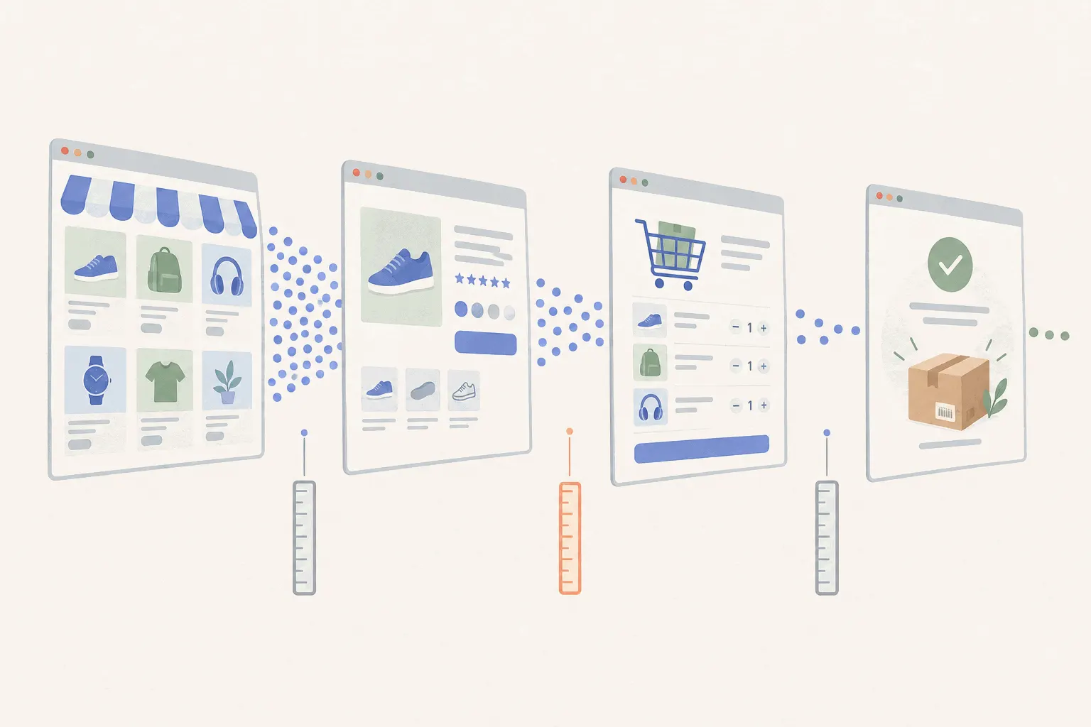
A funnel follows the same visitors through an ordered set of steps and shows how many make it to each one. For a product page, a useful funnel looks like this:
- Viewed the product page
- Interacted with the page (picked a variant, opened the size guide, scrolled to reviews)
- Added to cart
- Started checkout
- Placed an order
The number to watch is the drop between two neighbouring steps, not the final conversion rate. A big fall between steps 1 and 2 means people leave before they engage at all, so look at the first screen: images, price, load time. A fall between 2 and 3 means they engaged but weren't convinced, which usually means missing information, unclear variants or doubts about delivery and returns. A fall after step 3 is often about shipping costs or payment options, not the page.
Build the same funnel for several segments and compare them. Useful splits:
- New versus returning visitors
- Mobile versus desktop
- Visitors from each ad campaign
- The product's top variant versus the rest
If visitors from one campaign fall off far more than others, the ad may be promising something the page doesn't show. That is a campaign fix, not a page fix.
Bigdelta builds funnels from first-party, server-side tracking and keeps the same visitor across sessions. That matters for products people research over several days, because a shopper who views the page on Monday and buys on Thursday stays one person in the funnel instead of becoming one drop-off and one unexplained purchase.
The funnel tells you where people leave, not why. The next two steps look at what they did on the page.
Step 3: Use heatmaps to see where attention goes
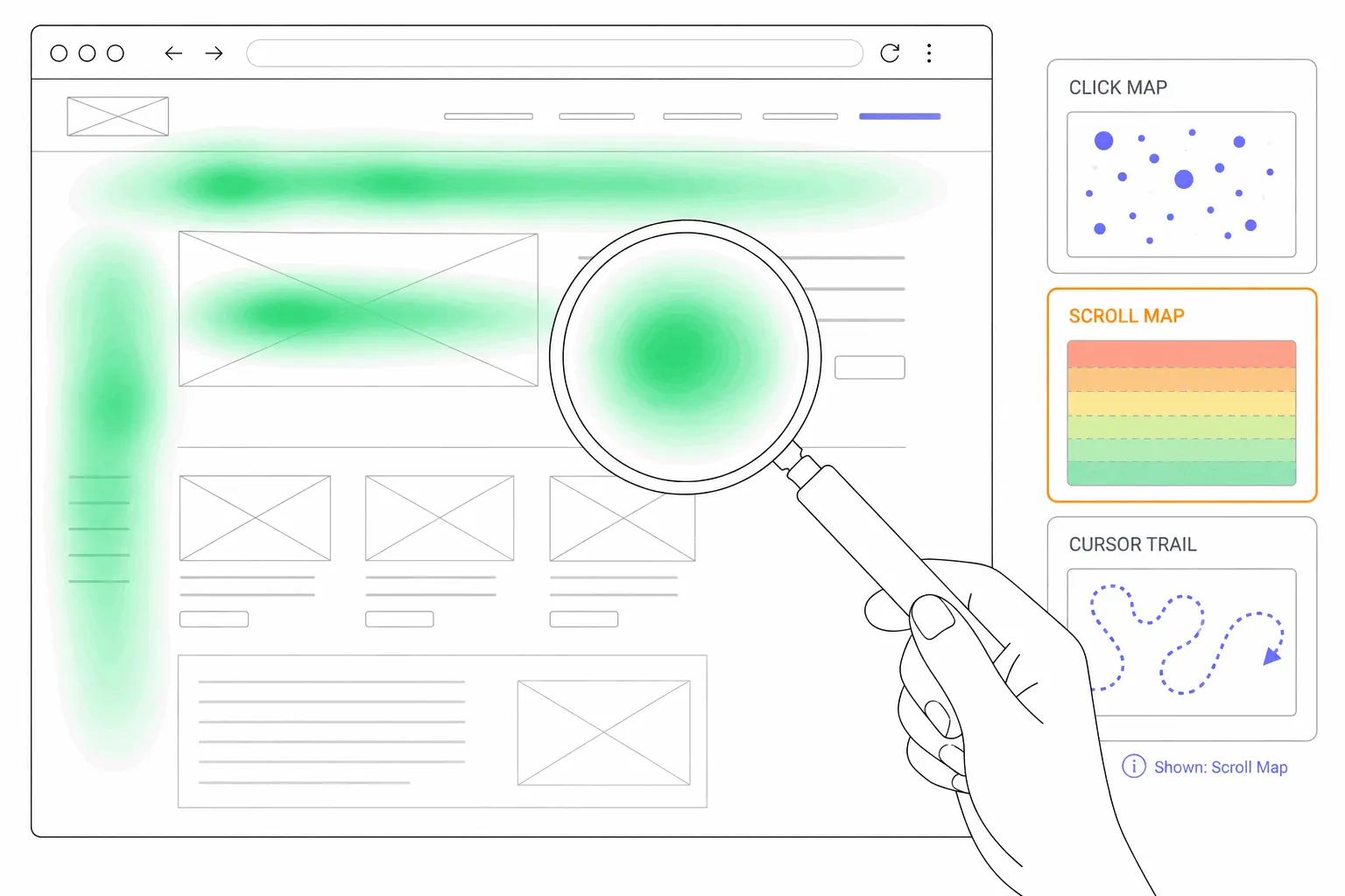
A heatmap adds up the behaviour of every visitor to a page into one picture. It's the quickest way to see how a product page is used before you watch individual sessions. Two types matter most:
- Scroll maps show how far down the page visitors get. If half of them never reach the reviews, the shipping details or the size guide, those sections might as well not exist.
- Click maps show where visitors tap and click, including on things that aren't clickable.
On a product page, look for these patterns:
- Clicks on the main image or thumbnails. People want to see the product closer. If the images don't zoom or there are too few, that's a gap.
- Clicks on non-clickable text or icons. A "Free returns" badge or a material name that people tap expecting more detail.
- Heavy clicks on the size guide, delivery or returns links. The answer isn't visible on the page itself, so people go looking for it.
- A sharp scroll drop above key content. Move the important information higher, or shorten what sits above it.
- Few clicks on the variant picker or the add-to-cart button compared with page views. The page isn't getting people to the point of choosing.
View the heatmap separately for mobile and desktop, since the layouts differ and a section that's visible on desktop can sit three screens down on a phone. If your tool lets you, compare the heatmap of visitors from the funnel step with the biggest drop against those who continued.
A heatmap shows what the crowd does. It hides the order of actions and the individual hesitations, which is what recordings are for.
Step 4: Watch session recordings of the drop-offs
A session recording replays what a visitor did on the page: where they scrolled, what they tapped, where they paused and when they left. Watched at random, recordings waste hours. Watched for one funnel step, they answer the question the funnel raised.
So filter first. Pick the step with the biggest drop and open recordings of visitors who reached it but not the next one. In Bigdelta you can open these straight from the funnel step, so you watch the 20 people who picked a size and then left, not 20 random visitors.
While watching, look for patterns that repeat across several sessions:
- Rage taps and dead clicks. Repeated taps on an image that doesn't zoom, or on text that looks like a link.
- Scrolling up and down between the same sections. The visitor is comparing something, often variants, sizes or the price against the delivery cost.
- Long pauses on the size guide, specs or shipping block. Something there is unclear or missing.
- Leaving for another tab or the search bar. They went to look for information the page didn't give them.
- Never scrolling past the first screen. The top of the page didn't earn attention, often a slow image or a price shock.
One odd session proves nothing. When five of twenty sessions show the same behaviour, you have a hypothesis worth testing.
Also watch a few sessions from visitors who did buy. Comparing them with the ones who left shows what the buyers found that the others didn't, for example that buyers scrolled to the reviews and leavers never got that far.
Recordings still have a blind spot. You can see a shopper hesitate over the size chart, but you can only guess what they were wondering. They didn't type the question anywhere.
Step 5: Let shoppers ask, and read what they ask
An AI chatbot on the product page closes the gap recordings leave. A shopper who hesitates over the size chart can type "I'm 182 cm, is L too long?" and get an answer from your product data. You get the question in writing.
That helps in two ways.
First, the shopper gets the missing information at the moment they need it, instead of leaving to search for it. A good product chatbot answers from the store's own catalogue and policies: sizing, materials, compatibility, stock, delivery times, returns. Algoshop, for example, is an AI sales chatbot for Shopify and WooCommerce stores that recommends products, checks stock and can add items to the cart from inside the chat. It also answers in the shopper's language, which matters if you sell across borders.
Second, and more useful for diagnosis, every conversation is a record of what your page failed to explain. Read them grouped by product, and the same questions come up again and again:
- "Does this fit the 2024 model?" means the compatibility information is missing or hard to find.
- "What's the difference between the Pro and the regular?" means the variant comparison isn't clear.
- "How long does shipping to Germany take?" means delivery details are buried below the fold or only shown at checkout.
- "Is this the same colour as in the photo?" means you need more or better photos.
Each repeated question is a page change you can make: a line in the description, a comparison table, a delivery estimate next to the price. Algoshop surfaces the top questions shoppers ask, so you don't have to read every transcript to find them.
The chat also tells you which questions come up right before people leave. Put that next to the recordings from Step 4 and you can match the behaviour (pausing on the size guide) with the question behind it ("runs small or true to size?").
Putting it together: a weekly product page review
The five steps work best as a short routine on your top-revenue products rather than a one-off audit.
- Metrics (10 minutes). List your top product pages by traffic and sort by add-to-cart rate. Pick the one or two with the most traffic and the weakest rate.
- Funnel (10 minutes). Find the step with the biggest drop for those pages, and check whether one segment or campaign is dragging it down.
- Heatmaps (5 minutes). Check the scroll and click maps for those pages on mobile and desktop. Note which sections people miss and what they try to click.
- Recordings (20 minutes). Watch 15 to 20 sessions of shoppers who left at that step. Note the behaviour that repeats.
- Chat (10 minutes). Read the most common questions asked on those pages that week. Match them to what you saw in the heatmaps and recordings.
- Change one thing. Add the missing answer to the page, then compare the same funnel step before and after.
The last step is the one most stores skip. Change one thing at a time and check the funnel after a week or two of normal traffic, so you know which edit helped. Stores with plenty of traffic on the page can go further and A/B test the change with a Shopify Rollouts experiment (Grow plan or higher), which compares the new version against the live store. With less traffic, a before-and-after comparison of the funnel step is the realistic option. When the chatbot stops getting the same question about a product, that's a sign the page now answers it.
Recommended tools
Bigdelta and Algoshop cover the five diagnosis steps. Two free tools help with checking page speed and testing your changes:
| Tool | Steps it covers | What you use it for |
|---|---|---|
| Bigdelta | 1. Metrics, 2. Funnels, 3. Heatmaps, 4. Recordings | Web analytics for ecommerce stores: product page metrics tied to real orders, funnels per campaign and segment, heatmaps, and recordings opened straight from a funnel step |
| Algoshop | 5. Chat | AI sales chatbot for Shopify and WooCommerce that answers product questions, recommends products and shows the top questions shoppers ask |
| Google PageSpeed Insights | 1. Metrics, 3. Heatmaps | Free load-time check for a product page on mobile and desktop, for pages where visitors leave before scrolling |
| Shopify Rollouts | Change one thing | Shopify's built-in tool for theme changes; on the Grow plan or higher it can run an experiment comparing your change with the live store |