What is an AI heatmap?
An AI heatmap is a model's guess at where people will look at a page, made from a screenshot before anyone has visited. How the guess is made, and where a measured heatmap takes over.
What an AI heatmap is
An AI heatmap is a picture of where a model expects people to look at a page, an ad or a mockup. You upload a screenshot or paste a URL, and a few seconds later the image comes back with warm colours over the spots the model thinks will draw the eye first. No visitor has seen the page, so the heat is a prediction.
The same product is sold under several names: predictive heatmap, attention heatmap, attention prediction, predictive eye tracking, AI heatmap generator. They all mean the same thing. A model trained on eye-tracking recordings is guessing what a group of people would look at in the first few seconds.
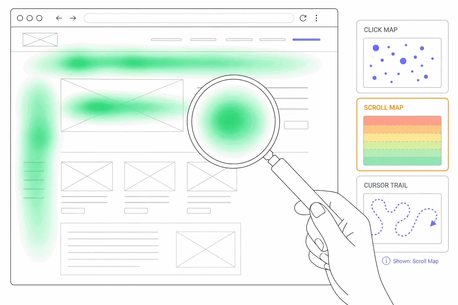
That makes it a different object from the heatmaps most site owners know. A website heatmap is built from real visits: clicks, taps, scrolling and cursor movement collected by a script on the live page. A predictive map needs none of that, which is both its appeal and its limit. One free "generate a heatmap from your URL" tool says so in its own small print: the map it emails you is a predictive example and uses no real visitor data.
How the prediction is made
The models behind these tools are called saliency models. Saliency is the research term for how much a spot in an image stands out: a face, a block of high-contrast text, a bright button on a dull background. Researchers have spent two decades building models that take an image and return a map of the regions people fixate on when they look at it with no particular goal.
To train and test them, academics collected eye-tracking datasets and published them. The MIT300 set from 2012 has 300 photographs, each viewed for three seconds by 39 people wearing an eye tracker. CAT2000, from 2015, has 4,000 images across 20 categories, from indoor scenes to line drawings. SALICON, also from 2015, reached 10,000 images by replacing the eye tracker with a mouse: viewers moved a cursor over a blurred image to sharpen parts of it, and the cursor path stood in for gaze. These sets are mostly photographs of scenes. Web pages are rare in them.
Commercial tools start from the same idea and add their own recordings. One vendor says its network was trained on about five and a half million fixations from studies where each design was shown for four seconds. Another says its data comes from more than 20,000 participants looking at ads, packaging, web pages and shop shelves. The raw output is a saliency map. The tool then dresses it up: a percentage of predicted attention for any region you draw, a "clarity" or "focus" score for the whole design, and sometimes a written recommendation.
What the accuracy claims mean
Every vendor quotes an accuracy figure, and the figures are high, typically between 85 and 96 percent agreement with lab eye tracking. One vendor says its score came from running its model on the 300 MIT benchmark images. Another says its map is statistically equivalent to an eye-tracking study of 100 to 150 people viewing an image for five seconds.
Read those claims for what they measure. Each one compares a predicted map with a real eye-tracking map of the same still image, viewed for a few seconds by people who were asked to do nothing in particular. That is how the benchmarks were designed. The number says nothing about whether a visitor will click the button, read the paragraph or finish the form. In most cases it also comes from the vendor's own testing, so treat it as a claim rather than a result you can check.
What a predictive heatmap is useful for
It answers one question well: when someone lands on this design cold, what will they notice first? That is useful in a handful of situations.
- Before launch. A mockup has no visitors, so there is nothing to measure. A prediction is the only heatmap you can get.
- Choosing between two versions. If two layouts are ready and neither is live, a prediction shows which one puts the headline and the button where the eye lands.
- Ads, thumbnails and packaging. These are seen for a second or two with no task in mind, which is close to the situation the models were trained on.
- Pages with too little traffic. A measured heatmap needs enough visits per page and device before the pattern settles. A page that gets twenty visits a month never gets there.
Where the prediction goes wrong
The models predict free viewing: a person looking at a still image with no goal. Almost nobody uses a website that way. A visitor arrives to compare prices, find the opening hours or finish a signup, and a goal changes where the eyes go. A 2016 paper in Computational Intelligence and Neuroscience put it plainly: saliency models have limited use because they perform well only in the context-free scenario.
The window is short as well. A 2026 study in Behavioural Brain Research tracked people looking at real-world scenes for 15 seconds each. In the opening seconds about seven in ten fixations landed on regions a saliency model had predicted, and viewers looked at much the same things. After that, gaze drifted apart from person to person as their own interests took over. A predictive heatmap describes those opening seconds and nothing after.
A screenshot is also flat. The model cannot see a menu that opens on hover, a carousel that rotates, or anything that appears once the visitor scrolls. It does not know that half your traffic is on a phone, or that returning customers skip the hero and go straight to the login link. And because the public datasets are mostly photographs, a model can be confident about a face in a stock photo and unsure about a pricing table. A 2025 article from one eye-tracking research firm said that for complex, context-rich situations real eye tracking is still the standard, and that predictive maps suit quick screening checks.
How a measured heatmap differs
A measured heatmap shows what visitors did: where they clicked, how far they scrolled, where the cursor lingered. It is built from the actual audience on the actual page, phone and desktop separately, and it keeps updating as the page changes. Its weakness is the mirror image of the prediction's. It needs a live page and enough traffic, and it can say nothing about a design that has not shipped.
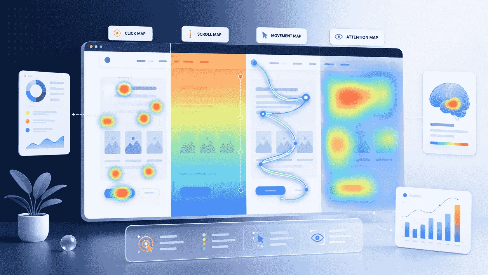
One more difference matters. A predicted map claims to show where eyes went. A measured map never does, because no website script can see eyes. The closest it gets is cursor movement on desktop, and the post on mouse movement heatmaps covers how loosely that follows gaze. Most heatmap tools work this way. Bigdelta's click, scroll, attention and move maps, for example, are all built from real visits, with nothing predicted.
The other kind of AI heatmap
The phrase has picked up a second meaning. Some heatmap tools now run an AI layer over real data: a written summary of which sections drew the most clicks, where scrolling stopped, and which elements got clicks nobody expected. Others let you upload a heatmap screenshot to a chat model and ask it what it sees.
This is the opposite of a prediction. The data is measured, and the AI only reads it. That is handy for a first pass, especially for someone who has never read a heatmap, but the summary is only as good as the map underneath and the model's guess about why a hotspot exists. A bright spot on a button can be people buying or people rage clicking, and a summary written from the map alone cannot tell the two apart. Check it against a few session recordings before you act on it.
Which one should you use?
Use a predictive heatmap when there is nothing to measure yet: a design in progress, an ad, or a page with so little traffic that a real map would take months to fill in. Use a measured heatmap as soon as the page is live and has visitors, and trust it over the prediction wherever the two disagree. It describes your visitors. The prediction describes an average viewer from a training set.
Never redesign on a prediction alone. The strongest thing a predictive tool can tell you is that a headline or button sits in a spot the model thinks nobody will look at. That is a reason to test the alternative before shipping it.
How to check a prediction once the page is live
Keep the predicted map. Once the page has collected enough visits, open the measured click map and scroll map for the same page and device and put the two side by side. Three things tend to show up.
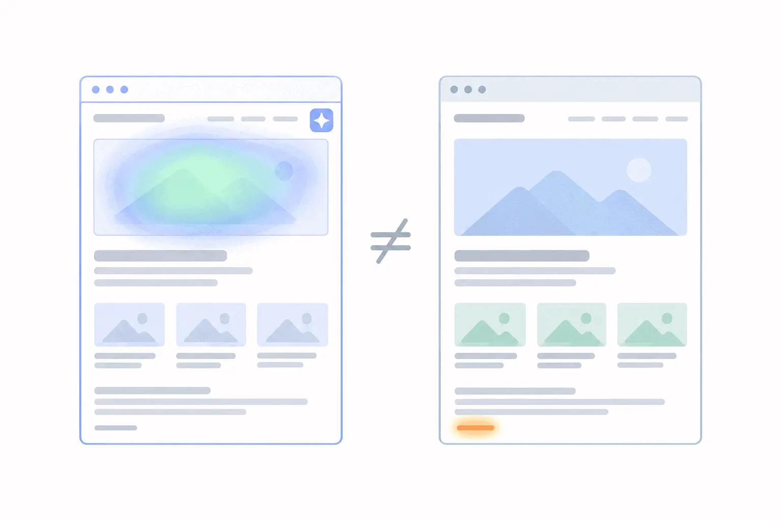
The hotspot the model missed: an element that drew real clicks but no predicted attention, often a link in plain text or something that only matters to people with a goal. The predicted hotspot nobody touched: a photo or a bold heading the model rated highly, which real visitors ignored. And the fold: a prediction says nothing about how far people scroll, so the measured scroll map decides whether the "high attention" section was ever seen at all.
How to analyze a heatmap covers the rest of the routine: enough visits before you trust a pattern, mobile and desktop read separately, and a second source before you change the layout. Treat the prediction the way you would treat a colleague's hunch. Worth hearing before launch, and replaced by evidence after.