How to reduce checkout abandonment
Most abandoned checkouts die for reasons shoppers will happily name: surprise costs, forced accounts, forms that ask too much. The fixes, in the order the evidence supports them - and how to find which one your checkout needs.
Start from the reasons buyers give
Roughly seven in ten started checkouts never finish - that's the baseline, and the benchmark post covers what counts as normal for your setup. The useful news for anyone trying to move the number: abandoning shoppers name their reasons readily, and the reasons cluster. Baymard Institute has surveyed US shoppers on this for years, and the answers are the closest thing checkout optimization has to a priority list.
One cohort to write off first: in Baymard's data, 42% of abandoners say they were just browsing or not ready to buy. No checkout change reaches them. Everything below is about the rest - the people who wanted the thing and left anyway.
The fixable reasons, ranked
Read the top of that list twice: pricing surprises and trust beat every UX nicety. A checkout redesign that doesn't touch when costs appear is polishing the wrong thing.
Among shoppers who abandoned for a reason you can do something about, Baymard's survey (multiple answers allowed) ranks the causes:
- Extra costs too high - shipping, taxes, fees appearing late: 40%
- Delivery too slow: 20%
- Didn't trust the site with card details: 19%
- The site wanted an account created: 18%
- Checkout too long or complicated: 17%
- Website errors or crashes: 17%
- Returns policy wasn't good enough: 13%
- Couldn't see the total cost up front: 12%
- Card declined: 10%
- Not enough payment methods: 9%
Kill the surprise costs
The single biggest fixable reason is costs appearing late in the flow. The fix is unglamorous: show shipping cost and the order total as early as honesty allows - a shipping estimate on the cart page, taxes calculated before the final step, no fee that debuts on the payment screen. If shipping depends on address, a zip-code estimator on the cart beats a surprise after the address form.
Delivery timing belongs in the same conversation. Baymard's testing found shoppers respond to a concrete delivery date - "arrives Thursday, March 12" - better than an abstract speed like "3-5 business days", because a date is something a person can actually decide against.
Make guest checkout the obvious path
Forced account creation is the most self-inflicted reason on the list. In a separate Baymard survey (4,384 US shoppers, 2022), 24% had abandoned a purchase because the site wanted an account - and yet Baymard finds that 47% of ecommerce sites still don't make guest checkout the most prominent option on the account-selection step.
The evidence-backed pattern: guest checkout first and visually primary, sign-in offered but secondary, and account creation moved to the order-confirmation page - where the customer has already paid, most fields are already filled, and creating an account costs them one password instead of one purchase.
Cut the form down
Baymard's 2024 benchmark puts the average checkout at 11.3 form fields; their testing says most transactions need about 8. The gap is where the "too long, too complicated" abandonments live, and closing it is mostly deleting and defaulting rather than redesigning.
Their field-reduction moves, in rough order of payoff:
- One name field instead of first/last - a large share of shoppers type their full name into "First name" anyway, then have to backtrack.
- Collapse "Address line 2" behind a link - most shoppers don't need it, and the empty optional field makes people pause.
- Hide the coupon field behind a link - an open coupon box sends full-price buyers off hunting for codes, and some don't come back.
- Default billing address to "same as shipping" - it's true for most orders; the minority can untick it.
- Ask for account creation after the purchase, never during it.
Reduce payment friction and payment fear
Trust concerns are harder to patch than forms, but the same research offers concrete moves: keep the payment step visually consistent with the rest of the store (a sudden redesign at the money step reads as suspicious), show security reassurance near the card fields rather than in the footer, and format the card form like the physical card - auto-detect the card type and auto-space the number, which most checkouts still get wrong.
Express wallets - Apple Pay, Google Pay, Shop Pay - help through a plain mechanism: they collapse address and payment entry into one confirmation sheet, skipping most of the form. Treat vendor claims of specific conversion lifts with suspicion; the shorter path is the argument, not a percentage. The same logic covers offering the payment methods your market expects - a missing local favorite is a quiet exit.
Find your leak before applying any of this
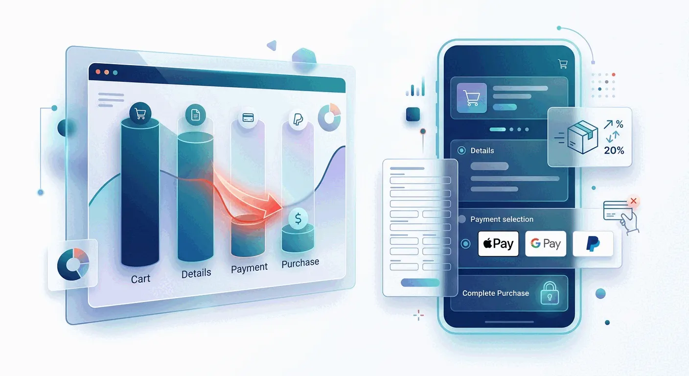
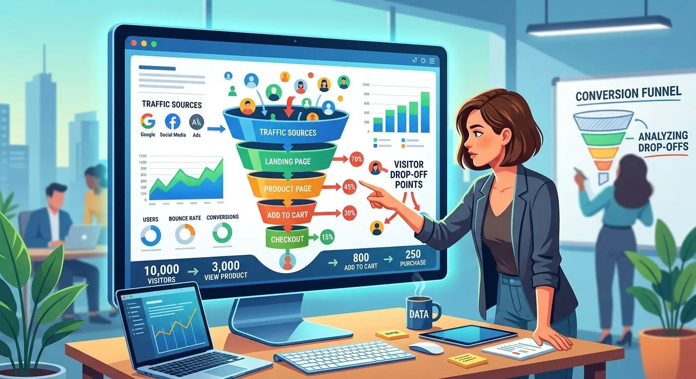
The ranked list above is the industry average; your checkout has its own worst step, and fixing the wrong one wastes a quarter. The instrument is a four-step funnel: checkout started, shipping entered, payment entered, purchase completed. In GA4 those are the standard ecommerce events - begin_checkout, add_shipping_info, add_payment_info, purchase - and any funnel tool can chart them. The step with the cliff names your problem: a cliff at shipping points at costs and delivery, at payment toward trust and methods.
The funnel says where; watching says why. Session replays of visitors who hit the leaky step and left show the actual failure - the validation error that wouldn't clear, the shipping price double-take, the coupon-field detour. Form analytics adds which exact field kills momentum. Ten replays of real abandonments usually settle arguments that a month of opinions couldn't.
What not to expect
Honesty about ceilings: the just-browsing cohort won't convert whatever you do, and no fix stacks neatly on another - the percentages above describe reasons, not recoverable revenue. Recovery emails can win back some abandoners who left contact details, but credible recovery-rate numbers are scarce and vendor figures are marketing, so treat that channel as a bonus, not a plan. The realistic prize is still substantial: Baymard's own estimate is that an average large ecommerce site carries dozens of checkout usability issues, and fixing them is worth on the order of a 35% conversion improvement - their number, from their benchmark of 344 major sites.
The practical takeaway
Show the full cost early, let people buy without an account, ask for less on the form, make paying feel as safe as it is, and let a funnel tell you which of those your checkout actually needs. In Bigdelta the funnel and the replays sit on the same data, so "where do they leave" and "what happened when they did" are the same afternoon's work. Whatever the tooling: diagnose first, change one thing, and watch the step - not the overall rate - to see whether it worked.