User journey analysis: following visitors across visits
User journey analysis connects one person's visits into a single path from first touch to purchase. What it shows, where identity limits stitching, and how to read journeys backwards from the conversion.
What is user journey analysis?
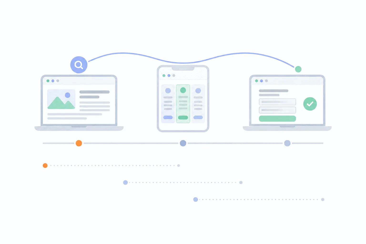
User journey analysis reconstructs the path a person takes from first contact with your site to an outcome that matters, a signup, a purchase, a booking, and looks across many of those paths for patterns worth acting on. The unit of analysis is the person over time, not the visit.
That lens changes what the Friday signup in the example means. A per-visit report calls it a direct conversion out of nowhere. The journey view shows a week of deciding that started with one blog post, which makes that post the real beginning of the revenue and the thing worth writing more of. Neither view is wrong. They answer different questions, and the journey question is usually the one founders actually ask: how do people end up buying?
Funnel, path or journey analysis?
Three overlapping terms cover this territory, and each one answers a different question.
A funnel is a sequence of steps you chose in advance, measured in aggregate: how many people passed each gate, in order, and where the rest stopped. It is the right tool for a designed flow like a checkout, and funnel analysis covers the method.
Path analysis is exploratory. Instead of steps you chose, the tool draws the routes people actually took. Google Analytics calls its version path exploration and describes it as exploring user journeys in a tree graph, built forwards from a starting page or backwards from an ending one, though not both at once. It is the tool for questions like "where do people go after the home page" and for discovering detours nobody designed.
Journey analysis is the widest lens. It crosses sessions and channels, so a search visit on Monday and a direct signup on Friday belong to one record. Use a funnel to measure a flow you built, a path report to explore behaviour around a single page, and journey analysis to understand how customers arrive at buying over days or weeks.
Why following a journey is hard
Web analytics is built on visits, and visits forget. A session ends after a half hour of idleness, and every tool defines that differently. The bigger reset is identity: an anonymous visitor is recognised by a cookie in one browser on one device, so the Monday laptop reader and the Wednesday phone visitor look like two strangers. Nothing connects them until the person does something identifying.
That something is the anchor: a signup, a login, a click from an email that carries who they are. From that moment on, a tool can hold the journey together, and tools with visitor profiles stitch it backwards as well. Bigdelta, for example, merges the anonymous pre-signup history into the person's profile when they identify themselves, and shows every channel they arrived from over time. What no tool can honestly promise is the journey of a stranger who never identifies, across devices, and who is visiting my website covers exactly where that line sits.
The practical consequence: journey analysis works best from the conversion backwards, because converts are exactly the people who identified themselves.
What you can see without knowing who anyone is
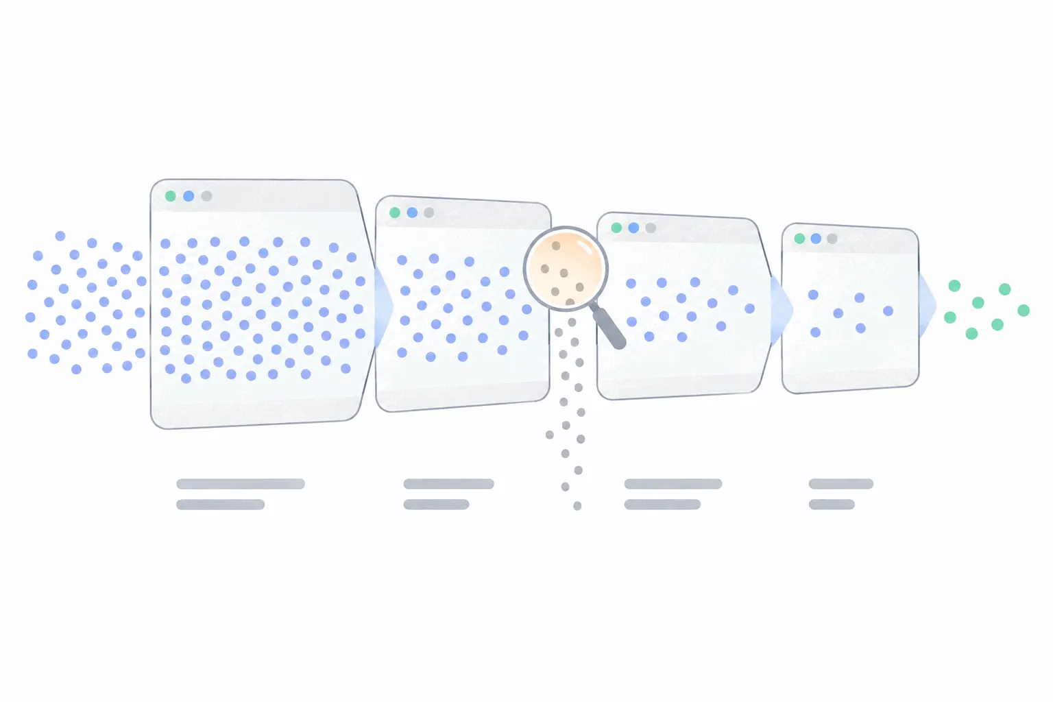
Plenty, in aggregate. Entry and exit pages describe where journeys begin and end even when the middle is dark. Landing-page cohorts show how visits that started on one page behave compared with visits that started on another. New-versus-returning splits say what share of today's visitors are on at least their second session. Some tools add visit-count and time-lag style reports that show how many sessions and days typically pass before a conversion, which is the shape of the journey without any names attached.
These aggregate views are worth exhausting before worrying about stitching, because they already answer the common questions: whether people convert on their first visit, and which pages start the visits that eventually convert.
Read the journeys backwards
The method that pays is the same one Google built backwards pathing for. Start from the outcome, take the people who reached it, and look at what their histories share.
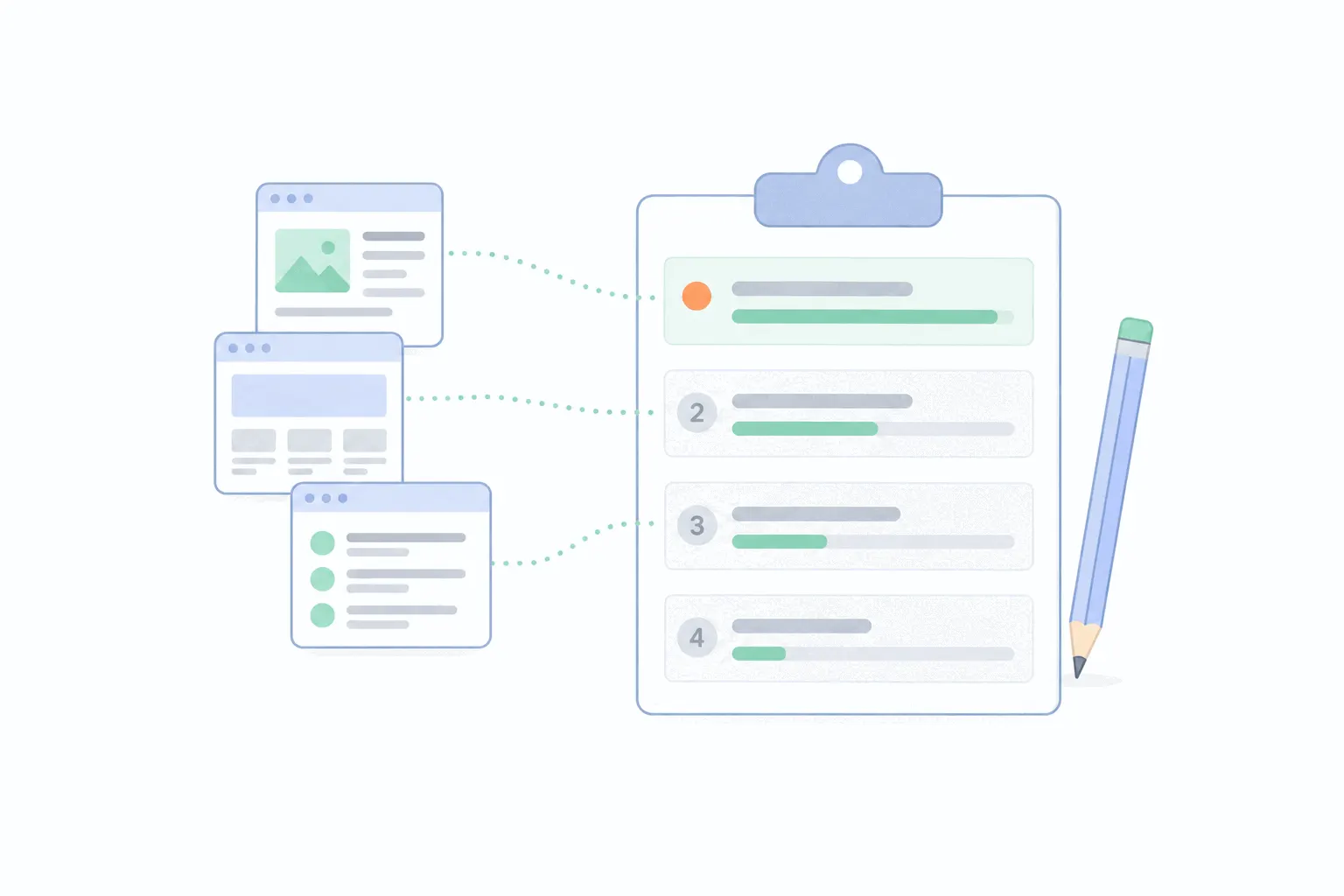
Pick one outcome, the same way a funnel starts with one conversion. Pull up the journeys of the people who got there, and ask which pages and channels keep appearing on the way. Then compare against visitors who never converted. The interesting pages are the ones common in converting journeys and rare in non-converting ones. That contrast is the whole trick, and it works with a few dozen conversions, no statistics degree required.
The pages doing quiet work
Backwards reading usually surfaces two kinds of unsung page. The starter is the blog post or guide that begins a large share of converting journeys. Its own bounce rate can be dreadful, and judging it by same-visit conversions would kill the best salesperson you have. Its job is to be found and remembered, and its fix is a clearer next step, not a harder sell.
The closer is the page that appears late in converting journeys: a comparison page, the pricing page, a case study. People visit it on their last or second-to-last session. Closers earn detail and reassurance, and they are where friction costs the most. Knowing which of your pages are starters and which are closers is the most usable output of journey analysis, because each kind gets improved differently.
Cut journeys by first channel and device
Averages hide different journeys the same way they hide different funnels. Split journeys by first channel and the patterns separate: search-first journeys might convert over three visits while ad-first journeys convert in one or never, which changes what each channel is for. Traffic sources explains the buckets.
Device mix is the other cut. A common shape is research on the phone and signup on the laptop, which makes mobile look like it converts nothing while actually feeding every desktop conversion. If your mobile conversion rate looks bleak, check whether mobile is where journeys start rather than where they end before redesigning anything.
When to watch a single journey
Aggregates find the pattern, and one real journey makes it concrete. When the data flags something, replays of a handful of matching sessions show the behaviour behind it, and session replay covers that workflow. Profile timelines have a second, unglamorous use: read one customer's history before a sales call or a support reply, and you skip the questions they already answered by their behaviour.
Where journey mapping workshops fit
Journey analysis has a workshop cousin. Nielsen Norman Group defines a journey map as a visualization of the process a person goes through to accomplish a goal, and its maintained guidance says the actions in a good map should be rooted in data. That is the honest division of labour: the workshop map is a set of hypotheses about how customers move, and the analytics is the evidence. Run them against each other. A map claiming customers compare prices early is checkable in an afternoon of journey data, and a data pattern nobody can explain is exactly what the next mapping session should chew on.
Journey analysis mistakes
Crediting the last page. The final visit closed a journey some other page started, and handing it all the credit is the same error that makes ad platforms and analytics disagree. Read the whole journey before assigning praise.
Treating the average journey as a real one. "Visitors take 3.4 sessions to convert" describes a distribution, and nobody takes the average path. Look at actual journeys, then at the spread, before designing for a composite person who does not exist.
Waiting for perfect stitching. Cross-device journeys of anonymous strangers are not coming. The usable version, aggregate shapes plus stitched histories of the people who signed up, is available today and answers most questions.
Reading journeys off ten conversions. A handful of paths is an anecdote. Collect enough conversions that the common-page contrast repeats before rebuilding the site around it.
Start smaller than that: pick your one outcome, pull the last thirty converting journeys, and count which pages appear in them. One afternoon of that beats a quarter of dashboard staring, and it usually renames at least one page from "underperforming" to "starter".