Lovable's built-in analytics: what it tracks and where it stops
Lovable ships a traffic dashboard with every published app. It answers 'did people come?' well — and goes quiet the moment you ask what they did.
What Lovable's analytics actually tracks
Every published Lovable app comes with a built-in analytics dashboard. It lives under More → Analytics in the project toolbar, requires no setup, and most people seem to discover it by accident a few days after launching. It's a nice touch — and it's more limited than it first appears. Worth knowing exactly where the edges are before hitting them.
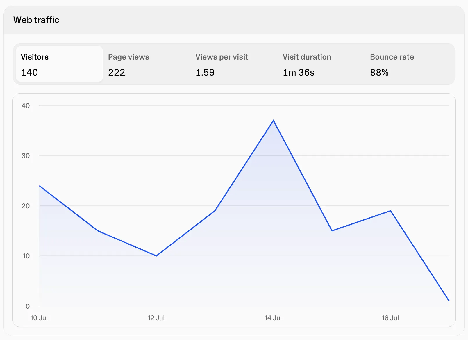
The dashboard covers traffic basics: visitors, pageviews, bounce rate, visit duration, traffic sources, devices, and which pages got viewed. Default window is the last 7 days, adjustable from today out to 90 days.
For a fresh launch, that's often enough. A typical morning-after-Reddit-post readout might be: 140 visitors, most from reddit.com, 80% on mobile, average visit under 30 seconds. That's a real finding — the post worked, people bounced fast, and the mobile layout probably deserves a look.
But every question that dashboard just answered was about traffic. Who came, from where, on what device. The moment the question shifts from 'did people come?' to 'what did they do?', the dashboard goes quiet.
Where it stops
There's no event tracking. An app with a signup button gets no data on how many people clicked it — only how many saw the page it sits on. Those sound similar but aren't. Pages with great traffic and near-zero conversion are common, and traffic numbers alone never reveal them.
There's no way to follow a visitor through the app, either. The dashboard counts visitors but can't say what path they took, where they hesitated, or where they gave up. That makes a whole class of questions unanswerable: how many people who landed on the homepage made it to the signup form, or which traffic source sends visitors who actually do something versus visitors who leave in ten seconds. The source that sends the most traffic and the source that sends the most engaged people are frequently different sources.
No events, no funnels, no way to watch what a confused visitor actually did. To be fair, Lovable isn't pretending otherwise. It shipped a traffic counter with the product, and as traffic counters go it's a decent one. The problem is what most people reach for next.
The Google Analytics detour
The reflex, after outgrowing the built-in dashboard, is Google Analytics. It's free, it's the default, and getting the snippet into a Lovable app is genuinely easy — Lovable will add the gtag code from a single prompt.
The snippet is the easy part. Then GA4 starts. Setting it up means creating a property, figuring out what a 'data stream' is, and discovering that a signup click isn't tracked until it's defined as a custom event — via GA4's event builder or Google Tag Manager, a separate product with its own learning curve. New events can take a day or two to show up in standard reports, which usually means an evening spent in DebugView wondering what broke. And the reports themselves are organized around concepts like 'engaged sessions' and 'key events', designed for marketing teams that have an analyst on staff.
None of this is insurmountable. Given a weekend or two, GA4 will do almost anything. But plenty of solo builders set it up, poke at the reports twice, and never log in again. A tool nobody opens isn't measuring anything.
The middle ground
What most Lovable builders actually need sits between the two extremes: more than a traffic counter, much less than GA4. The next questions after launch are usually simple ones. Did anyone click the button. Where do people drop off. Why did 140 visitors produce two signups.
That's the gap Bigdelta covers. It's web tracking that picks up where Lovable's dashboard stops — visits and sources, but also the clicks and page-to-page paths that show what people did once they arrived. And for the questions numbers can't answer, it has session recordings and heatmaps: instead of staring at a bounce rate and guessing, watch a replay of someone landing on the pricing page, scrolling halfway, hovering over the plan toggle, and leaving. Five recordings like that usually explain a bad conversion rate faster than any chart. Heatmaps do the same for layout — it's a particular kind of humbling to see the element everyone clicks is the one that isn't a button.
Adding it to a Lovable app is the same kind of job as adding the GA snippet, a few minutes of prompting, except the reports on the other end were built to be read by the person who built the app, not by an analyst.
The honest tradeoff: GA4 will always have more knobs. If a project eventually needs BigQuery exports and audience segmentation across ad platforms, the complexity buys something. For a Lovable app trying to figure out whether the signup flow works, it mostly buys a weekend of configuration.
The practical takeaway
Keep the built-in analytics; it costs nothing and handles traffic questions fine. The decision worth making early is what the next question will be. If it's 'which page got viewed the most', the built-in dashboard already answers it. If it's 'did anyone click the button' or 'why is nobody signing up' — and it will be, usually within a week or two of launch — set up event tracking and session recordings before that week, not after. The one thing no analytics tool can provide is data from before it was installed.