How to see where users get stuck on your website
Session recordings and heatmaps turn a drop-off number into a video of the exact moment someone gave up. The four friction patterns to look for, and the four-step workflow for finding yours.
What a funnel can't tell you
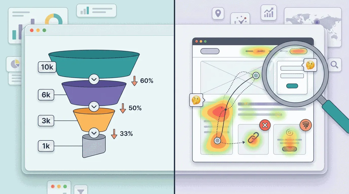
A funnel report can tell you that 62% of visitors left the pricing page without clicking the signup button — a number with no reason attached. The button might be blending into the background. The page might look finished halfway down. Someone might be quitting a card field at the security code. Heatmaps and session recordings are how you turn 'might' into an actual answer.
That's the gap heatmaps and session recordings close. A scroll map shows how far people actually get before they quit. A click map shows what they tried to interact with, including things that were never clickable in the first place. A session recording shows the exact cursor movement, hesitation and click of one real visitor failing to do the thing you built the page for. None of them replace the funnel — they explain the number the funnel already gave you.
Four friction patterns worth learning to spot
The same handful of failure patterns show up on almost every site once you start watching. Learn to recognize the shape of each and you'll spot most problems in minutes instead of afternoons:
- The false bottom. A scroll map shows a sharp drop in warmth right above a background color change or a large block of whitespace — visitors read that as the end of the page and stop scrolling before they reach the form or pricing table underneath it. Fix: remove the visual floor and add a cue, like an arrow or a teaser line, that signals there's more below.
- Banner blindness on the real CTA. Sometimes the cold zone isn't at the bottom of the page — it's directly over your primary button, because it's styled enough like an ad or a decoration that people's eyes skip past it, a reflex from years of ignoring banner ads. Fix: make the button look like the one thing on the page you actually want clicked.
- Rage clicks on dead elements. A click map shows a tight cluster of repeated clicks on something that isn't a link at all — bolded text, an icon, a static screenshot — because it looks like it should do something. Fix: wire it up, or restyle it so it stops looking clickable.
- Form hesitation. In a session recording, the cursor circles a field, leaves, comes back, and the visitor closes the tab without submitting — usually at a field like phone number, password rules or card details. Fix: cut the field if it isn't essential, or add a line of reassurance next to it, like 'No card required'.
How do you find your own friction points?
Start with the number, not the video — watching recordings before you know where to look wastes hours on pages that are already fine. Pull your funnel and find the step with the worst drop-off: landing page to signup, cart to checkout, pricing to demo request. That step is where the rest of the work happens.
Open the scroll map for that page next and check reach: what share of visitors scroll far enough to see the thing you want them to click? If your CTA sits below where most people stop, you've found a false bottom without watching a single recording.
Then check the click map on the same page. Are clicks landing on the CTA and stalling there, or landing somewhere that isn't a link at all? A cluster of clicks in the wrong place usually points at the layout, not the offer.
Only then go to recordings, and go in with a filter: visitors who spent real time on the page, thirty seconds or more, and didn't convert. That excludes the people who bounced in two seconds for unrelated reasons and leaves you with the ones who were actually trying. Ten to fifteen recordings is usually enough to see the same hesitation repeat three or four times — that's when you've found a pattern instead of a one-off.
Numbers find the page; recordings explain it
This is where the funnel and the visual tools have to work together, not compete. The drop-off rate tells you which page is worth your time; the heatmap and the recordings tell you what to change on it. Skip straight to recordings without the funnel first and you'll spend an afternoon watching perfectly healthy pages. Stop at the funnel and you'll redesign based on a guess.
In Bigdelta, the funnel and the session recordings sit on the same data, so the segment of visitors who dropped at a given step is something you watch, not a hypothesis you have to reconstruct by stitching two tools together.
The practical takeaway
Don't start with a redesign — start with the step that's actually losing people, confirmed by the funnel, not a hunch. A checkout is the clearest version of this: pin down where in the checkout flow people quit before deciding what to fix. Check scroll reach, check where clicks land, then watch ten or fifteen recordings of visitors who tried and failed. Most friction turns out to be one of four familiar shapes — a false bottom, a blind CTA, a dead element eating rage clicks, or a form field nobody wants to fill in — and each one is usually a smaller fix than the redesign you were about to start instead.